Tuesday, June 30, 2015

Pattern Correlations with Temperature

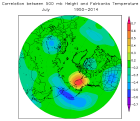
This is a quick post to show a series of figures that I created recently while examining the connection between Bering Sea pressure anomalies and temperatures in Fairbanks.  Each of the maps below shows the correlation between monthly-mean sea-level pressure (left) or 500 mb height (right) with the monthly-mean temperature in Fairbanks.  It's interesting to see the seasonal progression of pressure patterns that tend to favor either unusual warmth or unusual coolness in Fairbanks.

Here are a few features that jump out at me; perhaps readers would like to suggest others.

- Upper-level heights over northwest Canada are strongly connected to Fairbanks temperatures in most months, but in summer the area of highest positive correlation shrinks and doesn't extend much beyond the borders of Alaska.

- In June the semi-permanent connection between Bering Sea low pressure and Fairbanks warmth (or high pressure and coolness) all but vanishes.  However, it starts to return already in July.

- There is an interesting difference between December and January, with December temperatures being most strongly connected to Bering Sea conditions, but with January temperatures being more heavily influenced by flow features to the east.


Friday, June 26, 2015

All-Time Record High Temperature Anniversary


100 year anniversaries don't come around very often. This is one of those rare exceptions. You see, 100 years ago, June 27, 1915, the weather observer at Fort Yukon wrote down a high temperature of 100°F in their monthly log (see Figure 1). That's right, a triple-digit temperature – in Alaska. In the 100 years since then, the record has been approached a few times but never equaled.


Figure 1. June 1915 scanned Cooperative form for Fort Yukon, Alaska.

Even though the 100°F temperature is recorded on June 27th, it most likely occurred the day before – June 26th. This observer made their readings at 2 p.m. every day and so when they inspected the min/max thermometer at 2 p.m. on the 27th, the 100°F temperature indicator was probably left there from the previous day. The typical time for a high temperature in June is around 5 p.m. Standard Time. Having a 1-day offset of temperatures is a quite common occurrence for Cooperative stations all over the U.S. That being said, it will always be shown as a June 27th observation.

Data Quality

Is this temperature reasonable? The basic answer is yes. Rick did an analysis for a conference in 2009 that described the Fort Yukon reading as plausible. He noted that it was near the solstice, skies were clear, and other very warm temperatures were observed. Figure 2 shows the highest temperature observed in the last few days of June in 1915.
Figure 2. Warmest high temperature during the last six day of June in 1915.

In Fairbanks, the high temperature reached a scorching 95°F on June 26th (likely the same day that Fort Yukon reached 100°F). Remarkably, this temperature occurred at or shortly after noon. According the the Fairbanks Sunday Times, a thunderstorm with hail formed (hail noted on Cooperative observer form) and cooled off the city (see Figure 3) at noon.


Figure 3. Fairbanks Sunday Times story from June 27, 1915.

If a thunderstorm had not cooled off Fairbanks so early in the day, it is entirely possible that they would have warmed by another 5°F. Also, since the 100°F temperature at Fort Yukon is only 5°F to 8°F warmer than the nearby stations, it is possible that a lack of clouds or a just-right wind direction allowed the temperature to jump a few degrees warmer than would ordinarily be expected. It is also possible the the reading is not valid. However, there is far too little evidence to toss the reading out. Therefore, it is the accepted state record.

So, congratulations to Fort Yukon on the 100th anniversary of the warmest official temperature in Alaska history!

Thursday, June 25, 2015

Cooling from Smoke

Parts of interior Alaska have been blanketed by smoke from wildfires in the past few days, and the smoke has become increasingly dense in Fairbanks.  The visibility reported at the airport was only 3/4 mile this morning, but the situation was even worse in Tanana, which was reporting less than 1/4 mile visibility owing to nearby fires.

It's been nearly 6 years since a comparable period of sub-1 mile visibility in smoke was reported in Fairbanks; early August of 2009 saw several days with these conditions.  Prior to that, August 2005 also brought heavy smoke, and of course 2004 was the summer of smoke; but this is the first time (since 1950) that such a heavy smoke episode has occurred so early in the year.

The chart below shows the climatological frequency of smoke being reported in the hourly observations; the peak is in the first half of July, with nearly 10% of all days reporting smoke.  However, the frequency peaks later in the summer for smoke that is more dense, as August smoke days are more likely to have low visibility.  In other words, when it's smoky in August, it's usually bad (median visibility of 1.5 miles in late August), but smoke is typically light in early summer (median visibility of 4.0 miles in late June).  This year's situation is very unusual.


With all the smoke obscuring the sky in Fairbanks, daytime temperatures have been significantly suppressed relative to what they would have been otherwise.  For example, the computer MOS forecasts for the high temperature in the past 3 days were 86, 85, and 85 °F, but the high temperature actually only reached 82, 77, and 70 °F respectively (the MOS scheme does not account for smoke).  The National Weather Service did better, with forecasts of 82, 81, and 79, but still missed yesterday's high temperature by nine degrees.

Last year Brian discussed the cooling effect of smoke with an example from the Kenai peninsula.  I thought it would be worthwhile to look at the history in Fairbanks to see if a clear relationship exists between smoke and temperature.  First, I looked at the history of MOS temperature forecasts since 2000; the following chart shows the difference between the forecast and the observed high temperature, for summer days with smoke reported between 10am and 10pm, and with visibility on the horizontal axis (note the logarithmic scale).  The visibility is calculated as the mean between 10am and 10pm.

The chart shows the expected relationship, with most days seeing cooler temperatures than predicted when smoke is dense.  The linear regression fit is not particularly good, but the regression line does have a near zero y-value for visibility of 10 miles (the highest reported by the ASOS platform), which is what we would expect if the forecasts are unbiased for smoke-free conditions.

Another way of looking at the problem is to calculate the difference between surface and 850 mb temperatures and examine the relationship with visibility on smoke days.  See below for this analysis.  The idea is that smoke would not significantly affect 850 mb temperatures but would cool surface temperatures, so we expect to see a relatively cooler surface when smoke is dense.  Note that this analysis goes back to 1950 and uses pre-ASOS visibility observations, which were often greater than 10 miles.

The cooling effect of smoke is clear, and the relationship is a little better than with the MOS analysis.  An alternative regression fit, using a second-order polynomial, is shown below; this seems a little more satisfactory in terms of capturing the drop-off in temperatures at sub-1 mile visibility.  Based on this analysis, it seems clear that smoke-caused temperature deficits can reach or exceed 10 °F in Fairbanks when the visibility drops below 1 mile; and this matches very nicely with what happened yesterday.


Here's an image from the SNPP satellite yesterday afternoon; Fairbanks is under the expansive, dense patch of milky white just to the right of center.  Individual fire plumes are visible in numerous locations.


Monday, June 22, 2015

North Slope Heat

Extreme warmth has enveloped the North Slope in the past couple of days, rivaling past record events.  Here are a few highlights:

- 82F at Deadhorse Airport, and 80F at the new Deadhorse CRN site.  According to the NWS, this is a new all-time record in the 20-year history at Deadhorse, although my data shows 82F on August 5, 1999.  Also, observations from Prudhoe Bay list 83F on two occasions, including June 21, 1991.  The Prudhoe Bay site was a few miles closer to the coast and thus generally cooler, so I think it's safe to say this is not an all-time record for the general area.

- Daily minimum temperature of 46F at Barrow on June 20.  This ties June 20, 1991, for highest minimum temperature so early in the year.  The all-time highest minimum temperature is only 53F.

- 73F at Wainwright airport.  This is a record high temperature for June (but historical data are missing from 1969-1998).

- 85F at Umiat yesterday.  The record for June is 90F, set on the same day in 2013.

Here's this morning's uncharacteristically sunny scene from the UAF sea ice cam in Barrow.  The temperature is back in the 30s now that the wind has gone around to the west.


Friday, June 19, 2015

Stagnant Flow Aloft

The blocking high pressure system that we noted on Monday has weakened somewhat and migrated a little to the west and north, but continues to have a strong influence over Alaska's weather.  It is residing near the Gulf of Anadyr, as seen in this morning's 500 mb analysis (see below).


The location of the persistent blocking high is unusual, as the Bering Sea is a climatologically favored zone for low pressure; blocking highs are much more common over eastern Alaska and northwestern Canada at this time of year.


With stagnant flow aloft and clear skies, the seasonally intense solar radiation is generating very warm temperatures throughout the interior and north of Alaska.  Many locations across the western interior have reached at least 86 °F today, including McGrath, Tanana, Kaltag, and Huslia, and even the North Slope is hot, with at least 63 °F in Barrow and 70s in other locations.  The 63 °F at Barrow is warmer than any temperature observed throughout last summer; the highest temperature for 2014 was only 58 °F.

The chart below shows how persistent the unusual warmth has been in Fairbanks since late winter.  Unfortunately - from the point of view of fire weather - it looks like relief will not arrive soon.  The map below shows the forecast 500mb height anomaly from 3 different computer models for 7-10 days from now, and all three show a very similar pattern of continued above-normal heights (and thus above-normal temperature) over central Alaska.


Update June 20: here's a map showing the climatological frequency of cut-off high pressure centers at 500 mb in June.  Northeastern Alaska and northwestern Canada lead the Northern Hemisphere in the frequency of these events, with an annualized rate of over 9 per year, which translates into nearly one per June on average.  This is also the highest frequency of any location in any month of the year.  However, the frequency is a lot lower over the Bering Sea.


Monday, June 15, 2015

Southwest Warmth

Another dramatic change of the weather pattern has occurred, as a strong and expansive upper-level high over southwest Alaska is now bringing unusual heat to the interior and especially to southwestern and south-central locations.  The map below shows the 500 mb height analysis from 3am AKST this morning, courtesy of Environment Canada.  Twelve hours earlier the 500 mb height was even slightly higher at Bethel and McGrath: 5870m, which is close to record territory.  It's actually the earliest in the summer than such a high 500 mb height has ever been observed at either location.


The pressure gradient at the surface kept a warm breeze blowing last night in many southwestern locations and led to some remarkably high overnight minimum temperatures.  For example, the lowest hourly temperature report was 68F at Dillingham, and Sparrevohn at 1600' elevation only dropped to 64F.  Note that the surface wind direction was northerly and thus blowing off the warm land mass rather than the cold ocean.  The temperature has risen to (at least) 88F this afternoon at Dillingham, which is close to the all-time record high of 92F (which occurred during the June 1953 event that set the all-time 500 mb height records in Bethel and McGrath - no surprise there).

The unusual warmth was also evident at Kodiak yesterday, where the high of 73F and low of 56F produced a daily mean departure from normal of +3.8 standard deviations.  This would be pretty extreme if the temperature distribution were Gaussian, but actually it's nowhere close to Gaussian, as we've noted before.  At this time of year, large positive temperature anomalies are much more frequent than large negative temperature anomalies, if we use the NCEI (formerly NCDC) 1981-2010 mean as the "normal".  For example, since 1981 the largest negative temperature anomaly was -1.9 standard deviations, but +2.0 standard deviations has been exceeded 60 times.  From a physical standpoint, this reflects the fact that there's no way for Kodiak to get much colder than normal in June, but it's not difficult to get unusual warmth advected from the mainland.  The current situation is a great example of this.

The chart below shows the histogram of June temperature anomalies within the 1981-2010 reference period.  Sometimes a Gaussian distribution assumption is a very poor one even for temperature.


Saturday, June 13, 2015

Sunshine and Frost

We're only about three weeks away from the summer peak in temperatures (less in some places), but various interior locations have seen freezes in the past few days despite the absence of night.  These include:

28F  Goldstream Creek COOP  June 13
30F  Tanana airport  June 12
30F  Huslia airport  June 11
27F  Bettles SNOTEL  June 12
32F  Bettles airport  June 12

Here's a webcam shot from Tanana yesterday morning, when the temperature was just rising above freezing.


This is only the fourth time a June freeze has been observed in Bettles after the 10th of the month (data from 1951-present), although freezes have been observed in July before (most recently July 3, 2002).  And in Fairbanks, the first 12 days of June have been the coldest since 1963.  Looking only at daily maximum temperatures, it has been the coldest start to June since 1935!  However, this anomaly will be largely erased in the coming days as temperatures bounce back above normal.

The sharp transition from May's heat to early June's chill this year reminded me of the dramatic change in 2013 in the other direction: from a cold May to a very hot June.  Is it possible that May and June temperature anomalies are inversely correlated?  To address this I calculated the correlation between mean temperature anomalies in consecutive months for Fairbanks - see the chart below.  There has been a very tiny inverse correlation between May and June temperatures over the period since 1977, but over the longer term the correlation was slightly positive; so this year's reversal is not a reflection of a consistent historical pattern in Fairbanks.


A more interesting result is the modestly positive correlation between April and May temperatures (as witnessed in 2013 and also this year) and to a lesser extent between July and August temperatures.

While I was looking at these numbers, I also examined the correlation between May and September mean temperatures, because I speculated recently that there might be a connection between May and September weather in Fairbanks.  There is a slight positive correlation over 1977-2014, but nothing to write home about (R=+0.34).  Looking at daily temperature data, the chart below shows the number of days in each May and September with a daily mean temperature anomaly of at least 2 standard deviations from normal (cold or warm).  1992 and 1995 obviously stand out, which is what drew me to this hypothesis, but there doesn't appear to be a robust connection between May and September frequency of extremes over the long-term history.  The 1990's were an interesting time with persistent El NiƱo anomalies in the tropical Pacific, so that could explain the 1992 and 1995 patterns.  (As an aside, the Pacific pattern is similar this year, leading to record rains in the central U.S. (recall the 1993 floods), so I wonder if September will show something unusual this year.)


Wednesday, June 10, 2015

Seasonal Forecast Skill

I recently discovered that the Climate Prediction Center's seasonal forecasts - and the history thereof - are easily accessible for point locations, and this makes it quite straightforward to analyze the performance of the forecasts.  I've long been curious about the degree of skill in the seasonal forecasts for Alaska, and I hope to dig into this a bit more in future posts.  So far I have looked at the temperature forecasts for Anchorage, Fairbanks, and Barrow, for the period 2005-2014.

Before looking at any numbers, it's important to bear in mind that the forecasts are probabilistic, with the predictand being the probability that the temperature (or precipitation) will fall within the lower, middle, or upper tercile of the reference distribution.  The reference period is currently 1981-2010, but prior to 2011 it was 1971-2000.  Probability forecasts are a bit less intuitive to the average user, and measuring the skill is a more subtle problem, but probabilities are really much more useful than deterministic forecasts for decision-making and risk management.

One simple method to examine the skill of the forecasts is to find the highest of the three tercile probabilities in each forecast, and then compare that to the observed outcome.  For example, a forecast of 20%-30%-50% for below-normal-above indicates that the above-normal category is more likely than either of the other two.  Note that CPC forecasts nearly always predict 33% for the near-normal category, so a more realistic example would be 17-33-50.  After proceeding through 10 years of forecasts, issued once per month for the closest 3-month season (i.e. "0.5 month lead" in CPC terminology), I calculated the following contingency tables:


The Fairbanks table, for example, shows that the forecast below-normal probability was highest on 4+5=9 occasions from 2005-2014, and 4 of these verified as below-normal, while 5 verified as near-normal.  Considerably more forecasts (36) had the above-normal category as most likely, and 20 of these verified as above-normal, while just 4 turned out to be below-normal.  On the whole we can see that the forecasts have a good ability to discriminate between outcomes: only 4 out of 45 forecasts were completely on the wrong side in Fairbanks.  (According to a chi-squared test, the skill is significant at better than the 99.9% level.  Note that I don't have a row for instances where the near-normal probability was highest, because this rarely or never happens in the CPC forecasts.  Also note that 75 out of 120 forecasts showed equal probabilities for all three terciles and therefore were excluded from the analysis, i.e. the CPC did not have an opinion one way or the other more than 60% of the time.)

Based on the contingency tables, the performance of the Anchorage forecasts looks similar to the Fairbanks forecasts and the level of success is fairly impressive (the significance level is again very high).  However, we can see that more forecasts were made for Anchorage (72 out of 120 months), especially on the cold side; this is because confidence is usually higher for seasonal forecasts in southern Alaska.

The Barrow forecasts are remarkable because not once did CPC indicate that below-normal was the most likely tercile, and out of 67 forecasts for above-normal, only one was decidedly wrong (summer 2014).  From this standpoint the forecasts are very successful.

Another way of looking at the forecast performance is to create a scatterplot of forecast probability versus observed outcome.  See below for these charts.  I chose to plot the above-normal probability on the x-axis, and the y-axis shows the observed temperature anomaly (in standard deviations so that different times of the year are directly comparable).  I've added a least-squares regression line (red) for all the non-33% forecasts, and the thick gray horizontal lines show the theoretical tercile boundaries for a Gaussian distribution.


We can see a nice positive slope for the regression line in Fairbanks and Anchorage, which means that the higher the forecast probability of above-normal, the warmer the outcome is found to be on average - as we expect.  We can also see that for Anchorage the regression line intersects the x-axis right at 33%, which is what it should do in theory.  However, if the forecasts were perfectly calibrated then the line would cross into the upper tercile at 50%, whereas in fact it's more like 42%.  This suggests to me that the Anchorage forecasts are actually under-confident: the CPC should be saying 60% or 70% probability of above-normal when it's only saying 50%.  I'll have to explore this idea more in future with a larger set of stations.

The result for Barrow is again very interesting as it appears the forecasts have little or no ability to discriminate between small and large deviations from normal.  Strictly speaking, probability forecasts are not designed to do that, but successful forecasts usually do.  In this case, we find that the temperature ended up in the above-normal tercile 76% of the time whenever CPC predicted above-normal; but when CPC made no forecast, the temperature was still above-normal 72% of the time.  I conclude that although the Barrow forecasts are very successful from a probability standpoint, the majority of the skill is coming from the long-term warming trend.  In other words, if CPC predicted above-normal every single time, the success rate would be nearly as good.

Sunday, June 7, 2015

Alaska Brightness

** It's been a while since I posed here but I thought the Deep Cold readers might like this. **

Did you know that interior Alaska actually receives more sun and twilight than any other place in the U.S.

Alaska is known for long summer days and long winter nights. However, if you average all 365 days together, everyone ends up with 12 hours of daylight and 12 hours of darkness throughout the course of the year no matter where in the world you are, right? Actually, that is not correct. 

Looking at the chart that accompanies this post (see Figure 1), the red line at the bottom of the chart shows that daylight at the equator averages about 12 hours and 15 minutes per day over the course of the year. Remember that the sun is a circle (not a point) and we receive daylight from the top of the sun's disc before the middle of the disk reaches the horizon. The same is true at sunset. This makes an average day over 12 hours everywhere.


Figure 1. Hours of daylight and daylight plus Civil Twilight by latitude. All data obtained from the U.S. Naval Observatory's Astronomical Observations Department.

At the equator, the sun moves nearly straight up and down with respect to the horizon. This means the sun rises quickly and sets quickly. As we move to higher latitudes, the path of the sun is more oblique; i.e., the sun moves more and more diagonally with respect to the horizon. It therefore takes longer for the entire disk of the sun to make is across the horizon at both sunrise and sunset. 

If the sun were a point and not a circle, the average length of a day would be 12 hours everywhere. Since the sun is a 2-dimensional circle from our perspective, the relative speed of the rising and setting dramatically changes the amount of light we receive. This effect is greatest at the Arctic and Antarctic Circles due to the effective ground speed of the sub-solar point near the solstices. The difference in cumulative day lengths between the equator and the Arctic Circle (for all 365 days) is 225 hours per year – or 37 minutes per day on average. 

Figure 2 and 3 show the length of daylight (Figure 2) and the combined length of daylight and Civil Twilight on the summer solstice.

 Figure 2. Length of daylight on the summer solstice.

Figure 3. Combined length of daylight and Civil Twilight on the summer solstice.

If we include Civil Twilight, which is when the entire sun's disk is below the horizon but by no more than 6°, the extra light for Alaska dramatically increases. At 69°N latitude, the 365-day average for daylight plus Civil Twilight is 15 hours and 6 minutes. At the equator, the 365-day average is only 12 hours and 52 minutes. The average difference in light (daylight plus Civil Twilight) is a shocking 2 hours and 16 minutes per day. Places just north of the Brooks Range (e.g., Umiat)  therefore receive the most usable light of any place in the U.S. Table 1 shows the cumulative length of daylight and Civil Twilight for Fairbanks, Barrow, Anchorage, and Juneau measured in hours.


Table 1. Annual hours of daylight and Civil Twilight for Fairbanks, Barrow, Anchorage, and Juneau.

The final two maps (Figure 4 and 5) show the length of daylight plus Civil Twilight for Alaska and the Lower 48. Again, note how much more light Alaska receives than the Lower 48 over the course of the year.

Figure 4. Average annual length of daylight plus Civil Twilight. The average is for all 365 days of the year. The map perspective is Alaska-centric.

Figure 5. Average annual length of daylight plus Civil Twilight. The average is for all 365 days of the year. The map perspective is Lower 48–centric.

The next time you hear someone complain about how dark it gets in Alaska during the winter, just remind them that interior Alaska is the light champion on the U.S.