Friday, May 30, 2014

Smoke Observations in Fairbanks

While it is still fresh in everyone's minds, I wanted to put up another quick post on smoke from the recent wildland fires. This time, we are looking at the extensiveness of the smoke observations at ASOS sites from Fairbanks southward.

Figure 1 shows the number of hours that a station reported smoke or haze between 5/19 and 5/28. Not all stations are equipped to detect smoke or to provide visibility readings so one cannot infer that dots on the map that did not report smoke were smoke free. Also, all station sites in the database, whether they have current observations or not, are included in the output dump of station coordinates.

The first few for days of the fire saw winds from the north. The fire and smoke moved from north to south during this time period. Beginning on May 24th, a thermal trough developed in the Interior and switched the winds to a southerly direction. Also, a strong inversion below 5,000' acted to prevent vertical mixing and to promote horizontal spreading out (see Figure 1 from previous post).

Somewhat surprisingly, smoke made its way through the Alaska Range and into the Fairbanks area. For 12 consecutive hours, Fairbanks reported smoke with a visibility of 6 miles or less (See Figure 3). So while Fairbanks is frequently inundated with smoke from Interior fires, occasionally they need to keep an eye to the south.

Figure 1. Number of hours with an observations of smoke or haze in the DS 3505 ISH hourly observation database between May 19 and May 28, 2014. 

Figure 2. Same information as Figure 1 but zoomed in to the Fairbanks area.

Figure 3. Twelve consecutive hourly observations from the Fairbanks International Airport on May 26th and May 27th, 2014. A 'K' in the Weather column indicates smoke.


Wednesday, May 28, 2014

Smoke Impacts on Temperatures

For this post we will have a slight geographical deviation from Interior Alaska. One of the many atmospheric impacts of the Funny River Horse Trail Fire has been the effect of dense smoke on incoming solar radiation. There is a body of research that looks at temperature effects due to smoke across large areas due to widespread smoke but relatively little on localized dense smoke and the accompanying reductions in incoming solar radiation. It may or may not be analogous to the effect of clouds on temperatures at the surface. In any event, the effect was immediate and substantial. The Fire is an interesting laboratory for looking at this relationship.

There are 8 Climate Reference Network (CRN) sites in Alaska. One of them, Kenai 29 ENE, happens to be in the Kenai National Wildlife Refuge a few miles north of the Funny River Horse Trail Fire. One of the many sensors that CRN sites have is for measuring solar radiation. In the first few days of the fire the wind blew from the north, away from the station. Beginning on May 23rd, the wind switched direction and blew from the south, toward the station.

We can evaluate the effect of smoke on incoming solar radiation by comparing two days that were cloud-free but had different smoke conditions. May 20th was clear with a brisk north wind. All smoke was blown to the south. May 24th was clear but with a southerly wind that blew smoke over the CRN station. While the CRN station does not report visibility, the nearby Soldotna ASOS reported visibility as low as 1/4-mile. The graphic that goes with this post shows the incoming solar radiation (measured in watts per square meter) and the air temperature. The solid lines represent solar radiation and the dashed lines represent air temperature. You can see that the solar radiation dropped by 300 to 450 watts per square meter when thick smoke blew in. The total solar radiation differential between the two days was almost exactly 50%. This overall reduction in energy prevented the temperature from rising after 10 a.m. despite a warmer airmass on the 24th than was present on the 20th (850 mb temp in Anchorage was 1.8°C warmer on the 24th).

Based on the temperatures at surrounding stations, the dense smoke likely suppressed the high temperature at the Kenai 29 ENE station by approximately 6°F. While the number of conclusions that can be drawn from a sample size of 1 is pretty limited, the anecdotal evidence is pretty compelling. Since there is a CRN site just northeast of Fairbanks, Fairbanks 11 NE, it would be interesting to go back and look for instances of dense smoke on otherwise clear days.


Figure 1. Chart of 24-hour temperature and incoming solar radiation on May 20 and May 24, 2014, at the Kenai 29 ENE CRN station.

Note: I put this chart up on my FB page earlier so it is possible that some people might be seeing this for the second time.

Additional materials: Here is an article from 1981 that discusses large-area temperature cooling due to smoke. It is from 1981 but is still interesting. In the article the temperature reduction in Alaska due to smoke in 1987 was 2°C to 4°C. : http://climate.envsci.rutgers.edu/pdf/RobockForestFire91JD02043.pdf

Tuesday, May 27, 2014

Upper-Level Cut-Off Lows

This is a follow-up to last week's post on the frequency of occurrence of upper-level high pressure systems, where I showed that the global reanalysis data indicates a higher frequency of blocking highs in recent years to the north of Alaska and over Greenland.  It is interesting to see what the patterns look like for cut-off low pressure systems; these events are considerably more frequent than cut-off high pressure centers at most locations.  The three maps below show the frequency of cut-off low pressure centers at 500 mb, for three successive periods, using the same method as in the previous post.


The maps reveal that upper-level cyclonic systems are most common over the northern part of Baffin Bay; the semi-permanent wintertime cyclonic swirl in this area is often referred to as the polar vortex, although the polar vortex is much more clearly defined and more stable in the stratospheric circulation.  There is also a high frequency of cyclonic action in much of the high Arctic and in the zone from the Sea of Okhotsk to the Gulf of Alaska.

The change in frequency from 1951-1980 to 2001-2013 is shown below; it's rather a noisy map, with a lot of small-scale features, but overall it seems there has been a net increase in the population of cut-off lows.


In view of the increase in frequency for both blocking highs and lows, we might expect that the mean westerly flow aloft has become weaker over time as the flow is more often blocked or stagnant.  This would be consistent with the hypothesis regarding potential implications of warming in the Arctic: as the pole-to-equator temperature gradient weakens, the jet stream will also weaken.  The maps below show the mean westerly wind in the three periods and, lastly, the difference between 1951-1980 and 2001-2013.  There has clearly been some weakening near the wind maxima off the northeastern United States and in the western Pacific; but the westerly wind has strengthened in some other locations, notably over central Asia.  A little more investigation would be required to measure the net decrease (if any) in westerly momentum.


Update: reader Eric asked about the ratio of cyclonic to anticyclonic blocks.  The map below shows the ratio of the frequencies for the entire history; cyclonic cut-off centers are more common in most locations, although eastern Alaska and northwest Canada are an exception.  In fact, looking again at the first three maps above, it is evident that northwestern Canada and eastern Alaska have the lowest frequency of cut-off lows of any northern location (north of 60 °N).


Saturday, May 24, 2014

Thunderstorms and Dewpoint

In Brian's post the other day, we saw that lightning activity in the Fairbanks area ramps up extremely rapidly in early June, with lightning being very unusual in May but quite frequent by mid-June.  I was struck by this (can't help the pun) because climatological changes in weather phenomena are rarely defined so rigidly by calendar date.  I was curious about the physical explanation for the rapid change and decided to look up the humidity data to see if a rapid rise in average humidity in early June might be a factor.  In other words, is there - as reader Eric speculated - a humidity threshold that must be met before thunderstorms become reasonably common?

The first chart below simply shows the climatological frequency of thunderstorm days, based on the hourly observations from Fairbanks airport since 1981.  This chart is closely akin to Brian's Figure 4, except that Brian showed an even more rapid rise in the total count of lightning strikes.  This makes sense, because as thunderstorms become more frequent they also become stronger on average, with more lightning strikes per storm.  In any case, we still see a very rapid jump in thunderstorm frequency after June 1, while the decline in late July and August is considerably more gradual.


The second chart, below, examines how the thunderstorm frequency depends on the daily (midnight to midnight) maximum in dewpoint temperature.  We see that the majority of thunderstorms in Fairbanks occur when there is rather high humidity, with the daily probability of thunder reaching nearly 30% for daily maximum dewpoints near 15-16 °C (60 °F).  The drop-off in thunderstorm frequency at the highest humidity levels may be an artifact of having too small a sample with such high humidity.  It is interesting that we do NOT see a pronounced threshold that must be satisfied before thunder can occur; the probability rises relatively smoothly with the humidity level.


Finally, I looked at the climatological frequency of days on which the daily maximum of dewpoint temperature is 50 °F or higher, which encompasses the great majority of thunderstorm events.  The chart below shows a rapid increase in early June, as for the thunderstorm frequency, but also shows that the climatological peak is much later than for thunder, as high dewpoints are common well into August.

What can we conclude?  It's very clear that the low-level humidity (dewpoint) is not the only factor determining thunderstorm activity, as the storm frequency drops off markedly even while the humidity is peaking in late July.  Moreover, there does not appear to be a hard dewpoint threshold that clearly defines thunder versus no-thunder days.  However, the rapid rise in both thunderstorm frequency and humidity in early June does suggest that the summer influx of humidity is an important contributor to the onset of summer storms.  A next step in the investigation might be to look at climatological changes in the vertical stability profile to see how the rising low-level humidity acts to destabilize the environment and favor deep convective overturning.

As an aside, the highest dewpoint observed so far this year in Fairbanks is 45 °F; and no thunder has yet been reported at the airport.

Friday, May 23, 2014

Chilly Interior Morning

A quick update to note the brisk temperatures this morning in the eastern Interior; here are a few overnight minimum temperatures:

Chicken  17 °F
Salcha RAWS  17 °F
Eagle airport  19 °F
Eagle coop  21 °F
Northway  25 °F
Goldstream Creek  27 °F


The low temperature of 21 °F at the Eagle coop is the coldest temperature on record there so late in the spring (data back to the early 1900's).  However, 18 °F was observed on May 22, 1983, and 14 °F on May 21, 1969; so this is a marginal record event.

The 17 °F reading at Chicken was not the coldest so late in the season, even for the relatively short period of record; 15 °F was observed there on June 5, 2006.  The chart below shows that the normal low temperature is just now reaching 32 °F at Chicken.  Only 4 days so far this year have failed to drop to 32 °F at night, but this is not in the least bit unusual.


El Niño Winter Temperatures

With a potentially strong El Niño taking shape, let's take a quick look at how temperatures in Alaska have responded to strong El Niños in the past. To define a strong El Niño, I used the Value of the Niño 3.4 region. A chart of historical values is shown in Figure 1. There are 8 events that crossed the 'Strong' threshold. Those 8 events were used in my subsequent analysis.


Figure 1. Oceanic Niño Index since 1950. Image source: http://ggweather.com/enso/oni.htm 

The first pass at looking for temperature patterns was the ESRL reanalysis site. I queried the December, January, February temperature anomalies for each of the years with a strong El Niño. Figure 2 shows the results.

Figure 2. Winter temperature departure (°C) from 1981-2010 normal during 8 strong El Niño events since 1950.

A pattern is clearly apparent. El Niño winters are markedly cooler in the northwest part of the state and slightly above normal in the Panhandle. End of story, right? Well, not exactly.

Remember that many stations in Alaska have seen their temperatures rise over the course of several decades. In some cases quite substantially. There are a myriad of reasons for this (climate change, station relocations, urbanization, sea ice reduction, etc.) that are not relevant to the current discussion. The ESRL reanalysis always uses the 1981-2010 climate normal period when calculating anomalies; whether it is wind, pressure, heights, or temperatures. Since the 1981-2010 temperature normals are higher (warmer) than previous decades, the data shown in Figure 2 actually overstates the magnitude (but not the pattern) of El Niño's effect on temperatures.

Since I have calculated normal temperatures for the three major stations in Alaska using the trailing 30-year climate normal periods (1921-1950, 1931-1960, etc.), we can compare the wintertime difference from the current normal period and also the wintertime difference from the temporally relevant normal period. Figure 3 shows the result of that analysis.

Figure 3. Winter temperature departure (°F) during 8 strong El Niño events since 1950 for Juneau, Fairbanks, and Anchorage using the current normal period and the temporally relevant normal period.

The chart in Figure 3 is a little busy but basically it gives a side-by-side comparison of how each of the 8 winter temperatures compares to the wintertime normal period at the time and the current wintertime normal. The solid fill pattern is the temperature departure from the relevant 30-year climate normal period and the stippled pattern is the temperature departure from the 1981-2010 normal period. What stands out, particularly in the rightmost (Overall) category is how the strong El Niño temperatures are actually warmer than normal in comparison to the normals from the relevant time period. Using the current climate normal period gives a false impression of how the temperatures actually respond to El Niño conditions. Using the appropriate climate normal period changes the relationship from negative to positive.

Additional information:

Here is a paper by John Papineau, formerly with the Anchorage NWS Office, with a description of the effect of El Niño in Anchorage.

John was also interviewed for an article in the Alaska Dispatch in 2012 discussing the effects of El Niño.

Wednesday, May 21, 2014

Upper-Level Blocking Highs

The strong high pressure observed aloft over Alaska early this month led me to wonder about the climatological distribution of these events, both in space and across the annual cycle, as well as long-term changes in the frequency of blocking highs (and lows) aloft.  From the standpoint of casual observation, it seems like recent years have seen a large number of strong high-latitude blocking events over Alaska, but it would be nice to see if the data actually shows that the frequency has been higher of late.  Another motivation is that there is speculation in the scientific community that high-latitude blocking is becoming more common over time because of warming in the Arctic; but again it would be nice to see what the data have to say.

To answer this I turned again to the truly wonderful NCEP/NCAR global reanalysis, which provides a long-term consistent gridded history of upper-level analysis fields.  Beginning in 1951, I calculated the mean 500 mb height for each day and then counted all the occasions on which each grid point had a higher height than nearby grid points to the north, south, east, and west.  When this occurred, the grid point was considered to be the location of a "cut-off" high pressure system or "anticyclone".  I adjusted the east-west spacing of the calculation at different latitudes to account for differing longitude-spacing of the grid points and eventually arrived at a complete history of the central locations of 500 mb high pressure systems.

The map below shows the mean annual frequency of occurrence of 500 mb high-pressure centers for three periods: 1951-1980, 1981-2010, and 2001-2013.  The main features of all three maps are very similar, which illustrates the stability of the climate system; all three show that the highest frequency of blocking high pressure systems over the entire northern extratropics is over the Arctic Ocean north of the Chukchi Sea.


Interestingly the 2001-2013 map shows a marked increase in frequency over the Arctic Ocean and also over Greenland.  The map below shows the change in frequency between 1951-1980 and 2001-2013.  There is a small increase in frequency evident over most of Alaska, but the more striking differences are located farther north and over Greenland.  Overall, it appears the data do support the idea of increased blocking in the high-latitudes, though the changes are highly regionally dependent and appear to be modest over Alaska.


There are lots of other interesting aspects of the data, including the seasonal dependence of blocking frequency near Alaska, but for today I'll just post one more map that shows how Fairbanks daily high temperatures in June vary with the location of blocking highs.  (June is the month with highest blocking frequency over Fairbanks.)  For each grid point, I found all the dates on which a cut-off high was observed at that location, and then I extracted the daily maximum temperature anomaly (relative to 1981-2010 normals) for Fairbanks on these occasions.  The map below shows that Fairbanks daily high temperatures average 4-5 °F above normal in June when a 500 mb blocking high is located over southeastern Alaska, around 2-3 °F above normal when a high is over Fairbanks itself, and 1-3 °F below normal when a high is over the Bering Sea.  This is not at all surprising, but it's interesting to see the shape and magnitude of the patterns.  No doubt the anomalies would be larger in magnitude if I had selected only the more intense blocking events, rather than all the occurrences of isolated high pressure aloft.


Tuesday, May 20, 2014

Thunderstorm & Lightning Climatology

Thunderstorm season is quickly approaching in Alaska. So when can we expect the lightning to commence and how frequently is it observed at various locations? The Bureau of Land Management (BLM) has lighting detection antennas around the State to monitor potential wildland fire activity. They generously provide the historical data for easy download to the general public as a series of GIS data sets. The data begins in 1986 and runs through 2013 (27 years). However, they implemented a new system for the 2013 season so that data is not necessarily comparable to the previous years and is therefore not utilized in the analysis for this post.

Nearly all lightning strikes occur during the months of May through September and about 85% are due to surface heating. Figure 1 shows the cumulative distribution of strikes by month for the years 2000-2012. As you can see, the overwhelming vast majority of strikes occur in the months of June and July.

Figure 1. Cumulative distribution of lightning strikes recorded by BLM in Alaska from 2000 to 2012.

This provides an interesting perspective on the year-to-year variability but doesn't tell us a lot about the spatial variation. Since the BLM data is geocoded, we can place the data on a map. Figures 2 and 3 show all of the lightning strikes from 1986 to 2012 around Anchorage and Fairbanks respectively. Each map is exactly the same scale and represents an area of 1,120 square miles. Most residents of Alaska are not surprised to find out that more lightning occurs in the Interior than the Southern Coast. However, the disparity is fairly striking (pun intended). The Anchorage area receives 1 lightning strike for every 45.0 square mines annually. The Fairbanks area receives 1 lightning strike for every 2.35 square mines annually. That means lighting is approximately 14 time more common around Fairbanks than Anchorage.

Figure 2. All lightning strikes in the vicinity of Anchorage recorded by BLM in Alaska from 1986 to 2012.

Figure 3. All lightning strikes in the vicinity of Fairbanks recorded by BLM in Alaska from 1986 to 2012.

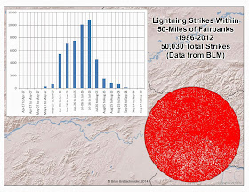
Looking at just he Fairbanks area, we see that 50,030 lightning strikes have been observed during the 1986-2012 time period for an area within 50 miles of Fairbanks. Half of those strikes occurred between June 16th and July 12th; a 27-day window! Figure 4 shows the distribution of strikes by 10-day time intervals around Fairbanks.


Figure 4. All lightning strikes within 50 miles of Fairbanks from 1986 to 2012 and a chart showing the frequency of strikes during 10-day intervals.

A look at the observations from the Anchorage and Fairbanks International Airports gives a good impression as the proximity of these storms to the respective airports. During that 27-year time period, there were 26 days with thunderstorms at the Anchorage International Airport and 210 days with thunderstorms at the Fairbanks International Airport. That is an average of 1.0 per year in Anchorage and 7.8 per year in Fairbanks. Since the number of lightning strikes around Fairbanks is 14 times more than around Anchorage, and the number of thunderstorm days per year in Fairbanks is 7.8 times more than around Anchorage, this tells us that any given thunderstorm day in Fairbanks is likely to experience twice as many strikes as a thunderstorm day in Anchorage. One factor not accounted for is cloud-to-cloud lightning. I am not sure if the BLM data captures those events or not. Figure 5 shows the annual number of thunderstorm days at the Anchorage and Fairbanks International Airports. 


Figure 5. Number of thunderstorm days per year in Anchorage and Fairbanks (observed at the respective airports) from 1986 to 2012. 


Postscript:

There are several papers that provide maps of thunderstorm frequency across the state. One is linked to in the first paragraph on this post. Others can easily be found using popular search engines.


Sunday, May 18, 2014

Precipitation Deficits

As we move into the heart of the fire season, it seems like a good time to highlight how little precipitation has fallen recently. If someone said that both Barrow and Ketchikan recorded above normal precipitation for the last two months, it would be reasonable to assume than many places in between were also above normal. That is most definitely not the case. Over the two month time period between March 17th and May 16th, I totaled all stations that recorded precipitation and have published NCDC normal precipitation values. The total measured precipitation during that time period was then compared to the normal precipitation to come up with a percentage of normal.

Values were only counted for days where a precipitation value was entered (including 0.00"). Both the numerator and denominator in the calculation only use days with valid data; i.e., if no precipitation value is entered on a day, the normal value for that date is excluded as well. A station must have 56 or more days of usable data during this time period for inclusion in the analysis. In many cases, missing data is a result of the lag time until data entry – not truly missing data. Figure 1 shows all 67 stations that met the inclusion criteria in Alaska. Figure 2 shows the same information but is zoomed in on the Fairbanks area. Figure 3 shows all of the data used to make the first two figures.


Figure 1. Percentage of normal precipitation in Alaska for for the 61-day period between March 17th and May 16th, 2014. Only stations with 56 or more days of usable data were included.

Figure 2. Percentage of normal precipitation around Fairbanks for the 61-day period between March 17th and May 16th, 2014. Only stations with 56 or more days of usable data were included. Note: the same legend items are used for Figures 1 & 2. Therefore, Figure 2 has several unused categories.

Figure 3. Table of data used to generate Figures 1 & 2. Only stations with 56 or more days of usable data were included.

Friday, May 16, 2014

Alaska Winter Temperatures and Teleconnections

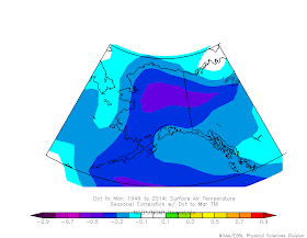
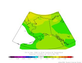
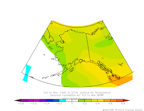
Reader Gary posed a question regarding the relationship between wintertime freezing temperatures and teleconnection indices. Fortunately, the ESRL reanalysis site has a very handy tool for correlating temperatures or other atmospheric variables to a variety of teleconnection indices. Frankly, there are a number of indices that I have never heard of. Nevertheless, I spent about 15 minutes systematically going through each index and generating a map of the correlation between the index value and October-March surface temperatures in Alaska between 1948 and 2014. Only 'interesting' ones were included. For reference, a correlation of +1.0 indicates a perfect positive relationship and a correlation of -1.0 indicates a perfect negative (or inverse) relationship. This is the same as Pearson's "R".

The rest of the blog post is the series of maps. Since there are so many I am not going to add a figure caption to each one at this time. The automatically generated legend tells which index was used. Also, the name of the index is pretty cryptic in many instances so here is the link to the page with a description of each index: http://www.esrl.noaa.gov/psd/data/climateindices/list/

One final note, there is a difference between causation and correlation. Just because something is correlated, doesn't necessarily mean there is a cause and effect relationship (e.g., the strong negative correlation between Alaska winter temperatures and the Antarctic Oscillation). Also, there is a lot of co-variance between data. For example, the PDO index is largely reflective of North Pacific sea surface temperatures. Therefore, it is not surprising that a large pool of warm air sitting right next to Alaska will cause Alaska temperatures to be warmer than normal.