In many previous posts, Rick and I have commented on the seasonal changes in solar radiation that are such a key part of understanding Alaska's climate, and I've also discussed the importance of "longwave" radiation, for example:
https://ak-wx.blogspot.com/2016/09/cloud-cover-and-temperature.html
As a reminder, "longwave" radiation is the infrared radiation that is constantly emitted and absorbed naturally by all objects, including blog readers and their immediate surroundings at this very moment. This is in contrast to "shortwave" radiation, which is only emitted in significant quantities by very hot objects like the sun. The earth's climate system is fundamentally driven by the ever-changing spatial distribution of shortwave radiation from the sun, but longwave radiation transfers between the surface and atmosphere (and out to space) are also a critical part of the energy balance.
I recently took some time to acquire a very nice satellite-derived radiation data set from NASA's CERES project ("Clouds and the Earth's Radiant Energy System"). Based on data from polar-orbiting satellite instruments, CERES provides global coverage with radiation data ranging from hourly to monthly time scales. With this, we can take a look at how the radiation energy budget works in Alaska and surrounding areas.
First, here's the most tangible element of the radiation transfer - the incoming shortwave at the surface - in mid-winter and mid-summer.
There isn't much to say about winter, but the July map highlights just how cloudy it is across a huge area of the North Pacific. It's also interesting to note the relative maximum in available solar energy in July over the high Arctic owing to 24-hour daylight. Of course this is part of the reason for concern over ice-albedo feedback in the Arctic Ocean; as ice extent decreases in summer, the albedo (reflectivity) of the ocean surface decreases dramatically and more solar energy is absorbed. Here's a map of July average albedo in the CERES data.
As a result of high albedo in the recent climate, the Arctic Ocean surface absorbs less solar radiation than surrounding land areas, so the net shortwave gain is relatively low:
Now let's look at longwave radiation, which is less intuitive but equally important for understanding the climate. First, the downward longwave; this is the infrared radiation emitted by clouds, water vapor, and other radiatively active gases in the atmosphere like carbon dioxide, methane, and ozone. The amount of longwave radiation emitted by the atmosphere is closely tied to the average temperature and absolute moisture content (e.g. precipitable water), so a warm and humid air column emits much more than a cold, dry one. Over Alaska, the coldest and driest atmospheric column is over the Brooks Range in January, but more extreme cold is found over eastern Siberia as well as the high Canadian Arctic.
The upward longwave emission from the earth's surface is just a direct reflection of the average temperature of the surface - see below. The relative warmth of the far North Atlantic (the Norwegian and Barents Seas) in winter is pretty striking.
Adding up the downward and upward longwave at the surface gives the net longwave radiation. The surface loses longwave energy on balance, but much more so in places (a) where it's warmer and so there is more longwave going around, and (b) where clear skies and dry air tend to prevail (more upward than downward emission).
Finally, putting all the pieces together to get the total net radiation balance yields the maps below. As expected, the high latitudes lose energy via radiation on average in January, with the largest losses found in relatively warmer regions, i.e. over the oceans (even if ice-covered). But note the relative maximum near the pole, where upward emission is low (thick ice cover and very low surface temperatures) but cloud and moisture aloft (probably derived from the North Atlantic influx) provides a bit more downward radiation than we might expect.
An interesting aspect of the July map above is that much of mainland Alaska gains less energy from radiation overall than the Gulf of Alaska and parts of the Bering Sea; I would not have guessed this, because I would have focused on the sunshine part of the equation. In reality the ocean surface is colder than the land in summer, so longwave emission is reduced over the water; and the summer ocean has a very low albedo that allows it to capture most of the available shortwave. Evidently these two factors more than compensate for the higher cloud cover over the ocean - so even though it's cloudier, the ocean near Alaska captures more energy from the summer sun than does the land.
And for a final map, the annual average net radiation gain at the surface. Apparently the region very near the pole actually gains a small amount of energy over the year - another surprising result.
With nearly two decades of CERES data now in hand, I'll plan to take a look at seasonal and year-to-year variations in Alaska in a subsequent post.
Objective Comments and Analysis - All Science, No Politics
Primary Author Richard James
2010-2013 Author Rick Thoman
Saturday, January 26, 2019
Sunday, January 20, 2019
Sea Ice Update
The past six weeks have seen some fairly persistent cold weather over the Bering Sea and western Alaska - much more so than over the rest of the state, where prior to the recent cold spell the winter had been relatively warm.
In response to the cold in the west, sea ice has expanded in the Bering Sea, and the ice area exceeded half a million km2 just the other day. In the 1981-2010 period, this milestone was typically reached just after the new year. So the ice growth is still a bit behind "normal", but it's a big recovery from last year.
NOAA's latest daily sea ice analysis shows the ice pack extending to the south of Nunivak Island but not yet reaching St Matthew Island farther to the west.
The NSIDC analysis is very similar.
The chart below shows the recovery off last year's record-low ice extent in the Bering Sea - we already have more than last winter's peak extent - but we're nowhere near the high ice coverage of just 7 years ago. The Bering ice extent of 2011-2012 was the highest in the modern satellite record for most of the mid-winter and meltout period, so sea ice has been highly variable in the Bering Sea over the last decade (to say the least).
The NSIDC provides ice extent data for other regions of the Arctic basin, so it's interesting to compare the long-term trends in both March (seasonal max) and September (seasonal min). See the chart below, showing the 40-year linear trends in percentage terms, i.e. the trend divided by the 40-year mean ice extent for each region. Of course some of the regions melt out completely every September, and many freeze up completely every March, so those cases have undefined and zero trends respectively.
Obviously the changes in ice extent have been much more dramatic at seasonal minimum, but nevertheless there have been highly statistically significant decreases in March ice extent in some of the basins - notably in the North Atlantic sector (e.g. the Greenland Sea and the Barents Sea). However, it's the Chukchi Sea that has the dubious distinction of the greatest percentage loss in September - see below. (Note that while the Bering Sea loss is also very high in September, the actual numbers involved are very small; another viewpoint would be to look at the absolute change in ice extent over time.)
In response to the cold in the west, sea ice has expanded in the Bering Sea, and the ice area exceeded half a million km2 just the other day. In the 1981-2010 period, this milestone was typically reached just after the new year. So the ice growth is still a bit behind "normal", but it's a big recovery from last year.
NOAA's latest daily sea ice analysis shows the ice pack extending to the south of Nunivak Island but not yet reaching St Matthew Island farther to the west.
The NSIDC analysis is very similar.
The chart below shows the recovery off last year's record-low ice extent in the Bering Sea - we already have more than last winter's peak extent - but we're nowhere near the high ice coverage of just 7 years ago. The Bering ice extent of 2011-2012 was the highest in the modern satellite record for most of the mid-winter and meltout period, so sea ice has been highly variable in the Bering Sea over the last decade (to say the least).
The NSIDC provides ice extent data for other regions of the Arctic basin, so it's interesting to compare the long-term trends in both March (seasonal max) and September (seasonal min). See the chart below, showing the 40-year linear trends in percentage terms, i.e. the trend divided by the 40-year mean ice extent for each region. Of course some of the regions melt out completely every September, and many freeze up completely every March, so those cases have undefined and zero trends respectively.
Obviously the changes in ice extent have been much more dramatic at seasonal minimum, but nevertheless there have been highly statistically significant decreases in March ice extent in some of the basins - notably in the North Atlantic sector (e.g. the Greenland Sea and the Barents Sea). However, it's the Chukchi Sea that has the dubious distinction of the greatest percentage loss in September - see below. (Note that while the Bering Sea loss is also very high in September, the actual numbers involved are very small; another viewpoint would be to look at the absolute change in ice extent over time.)
Saturday, January 12, 2019
Cold Frequency This Century
The cold snap is on its way out across Alaska now, as Pacific low pressure approaches from the southwest and a blanket of clouds aloft provides a warming influence. McGrath saw the temperature rise from -50°F this morning to "only" -18°F this evening as the sky turned overcast. However, severe cold is hanging on across the north, with -40s in the Yukon flats, and Umiat is currently sitting at -52°F on the North Slope.
Here's a chart showing some statistics for winter cold in Alaska since the turn of the century. The black markers show each winter's statewide minimum temperature, and the columns indicate the number of daily reports in which the daily minimum temperature reached -40°F and -50°F. This is based on data from NOAA's ACIS tool, which includes daily temperature data from about 400 sites (but closer to 300 at the beginning of the century).
The frequency of extreme cold has been on quite a roller coaster, with (for example) -40° or colder showing up somewhere in the state on 89 separate days in winter 2011-2012, but only 25 days in 2015-2016. (But this ignores the confound of mismatched observation times, such as morning coop reports.)
See here for an earlier post about statewide minimum temperatures on a longer time scale:
http://ak-wx.blogspot.com/2016/03/statewide-minimum-temperature.html
Here's a chart showing some statistics for winter cold in Alaska since the turn of the century. The black markers show each winter's statewide minimum temperature, and the columns indicate the number of daily reports in which the daily minimum temperature reached -40°F and -50°F. This is based on data from NOAA's ACIS tool, which includes daily temperature data from about 400 sites (but closer to 300 at the beginning of the century).
The frequency of extreme cold has been on quite a roller coaster, with (for example) -40° or colder showing up somewhere in the state on 89 separate days in winter 2011-2012, but only 25 days in 2015-2016. (But this ignores the confound of mismatched observation times, such as morning coop reports.)
See here for an earlier post about statewide minimum temperatures on a longer time scale:
http://ak-wx.blogspot.com/2016/03/statewide-minimum-temperature.html
Wednesday, January 9, 2019
Cold Update
Here's a quick update on the colder reports so far in this notable but not yet extreme cold spell that is reminding much of mainland Alaska what real winter feels like.
Fairbanks airport made it down to -39°F and had a couple of days with midnight-to-midnight high temperature below -30°F, but cloud and light snow brought temperatures back up to near zero today. Elsewhere in the central and eastern interior it's mostly colder, with -40s hanging on in Tok and the most sheltered valleys of the Fortymile region; and fresh, very cold air is working its way down across western Alaska, with lots of -40 reports showing up late today. Click below to enlarge.
As is often the case, Chicken has been the "winner" for cold, with a -56°F low temperature reported as of Monday morning.
The hourly data from the Fortymile River HADS site at the Taylor Highway showed similar numbers for Monday, with afternoon temperatures rising just a couple of degrees to -50°F. (As an aside, note the elevation: 1558 feet; this is part of the reason why the narrow valleys of this region get so cold. Chicken is at 1800 feet.)
Other sites that have dipped below -50°F are Tok and Fort Yukon.
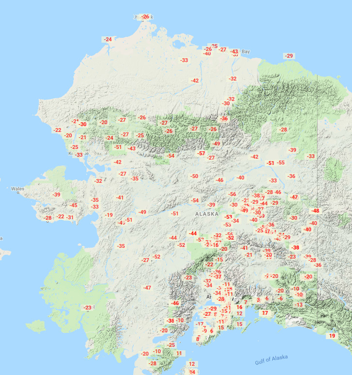
As impressive as these numbers seem in comparison to the last year or so, we don't have to go back even two years to see colder conditions - the map below shows the minimum temperatures on January 18, 2017 (courtesy of http://xmacis.rcc-acis.org/). But the next few days may rival this - will someone see a -60°F for the first time in several years?
Fairbanks airport made it down to -39°F and had a couple of days with midnight-to-midnight high temperature below -30°F, but cloud and light snow brought temperatures back up to near zero today. Elsewhere in the central and eastern interior it's mostly colder, with -40s hanging on in Tok and the most sheltered valleys of the Fortymile region; and fresh, very cold air is working its way down across western Alaska, with lots of -40 reports showing up late today. Click below to enlarge.
As is often the case, Chicken has been the "winner" for cold, with a -56°F low temperature reported as of Monday morning.
The hourly data from the Fortymile River HADS site at the Taylor Highway showed similar numbers for Monday, with afternoon temperatures rising just a couple of degrees to -50°F. (As an aside, note the elevation: 1558 feet; this is part of the reason why the narrow valleys of this region get so cold. Chicken is at 1800 feet.)
Other sites that have dipped below -50°F are Tok and Fort Yukon.
As impressive as these numbers seem in comparison to the last year or so, we don't have to go back even two years to see colder conditions - the map below shows the minimum temperatures on January 18, 2017 (courtesy of http://xmacis.rcc-acis.org/). But the next few days may rival this - will someone see a -60°F for the first time in several years?
Saturday, January 5, 2019
Colder Statewide, Snowy December in Bettles
A deep winter chill has descended upon much of Alaska this weekend, with temperatures dropping well below zero in the usual cold spots. So far Fairbanks airport has dropped to -34°F, which is colder than anything that occurred last winter. Of course it is a rare winter in Fairbanks that doesn't drop to at least -35°F at some point.
A few other cold spots today are:
Chicken -49°F
Fortymile River HADS -43°F
North Pole -39°F
Salcha RAWS -38°F
The Fortymile River HADS site (on the Taylor Highway) did not rise above -40°F today, and with the cold expected to deepen somewhat in the next few days, I'd be very surprised if Chicken doesn't crack -50°F. Only two winters in Chicken's climate record (1996-present) have failed to reached -50°F, and -60°F or colder occurs in about half of all winters.
Alaska's snow pack is below normal in many places, but one area with plenty of snow is the upper Koyukuk region; observers from Bettles up to Wiseman are reporting 30" or more of snow on the ground (click to enlarge maps below).
Remarkably, Bettles had its snowiest calendar month on record in December, with 62" of snow. The typical annual snowfall in Bettles is close to 90" - fairly high for an interior valley location - but nevertheless 60" in a month is a lot.
A scatter plot of December snowfall and average temperature in Bettles shows a slight positive correlation, as the coldest months tend to be drier than normal; this is partly because the coldest Arctic air masses hold little moisture in winter, and partly because clear skies (associated with high pressure and dry weather) produce sustained temperature inversion and cold conditions at this time of year.
As we've noted before, the situation is quite different in Fairbanks owing to the effect of dry chinook winds from the south. The proximity of the Alaska Range means that the warmest months, which are dominated by southerly flow, also tend to be dry, and so the snow-temperature plot shows a peak in snowfall at near-normal temperatures.
A few other cold spots today are:
Chicken -49°F
Fortymile River HADS -43°F
North Pole -39°F
Salcha RAWS -38°F
The Fortymile River HADS site (on the Taylor Highway) did not rise above -40°F today, and with the cold expected to deepen somewhat in the next few days, I'd be very surprised if Chicken doesn't crack -50°F. Only two winters in Chicken's climate record (1996-present) have failed to reached -50°F, and -60°F or colder occurs in about half of all winters.
Alaska's snow pack is below normal in many places, but one area with plenty of snow is the upper Koyukuk region; observers from Bettles up to Wiseman are reporting 30" or more of snow on the ground (click to enlarge maps below).
Remarkably, Bettles had its snowiest calendar month on record in December, with 62" of snow. The typical annual snowfall in Bettles is close to 90" - fairly high for an interior valley location - but nevertheless 60" in a month is a lot.
A scatter plot of December snowfall and average temperature in Bettles shows a slight positive correlation, as the coldest months tend to be drier than normal; this is partly because the coldest Arctic air masses hold little moisture in winter, and partly because clear skies (associated with high pressure and dry weather) produce sustained temperature inversion and cold conditions at this time of year.
As we've noted before, the situation is quite different in Fairbanks owing to the effect of dry chinook winds from the south. The proximity of the Alaska Range means that the warmest months, which are dominated by southerly flow, also tend to be dry, and so the snow-temperature plot shows a peak in snowfall at near-normal temperatures.
Monday, December 31, 2018
Warmth Since June 2013 - Part II
A couple of weeks ago I wrote about the remarkable persistence of unusual warmth in Alaska ever since the sudden and dramatic change in early summer of 2013. As promised then, I'd like to take a look at the larger climate patterns that have prevailed in the Northern Hemisphere over the same period; this will give us a sense of the broader context for Alaska's experience and perhaps also suggest potential explanations for the change.
First, the map below (click to enlarge) shows the percentage of calendar months since June 2013 in which the average temperature has been above the 1981-2010 normal, according to NCEP/NCAR reanalysis data. This isn't the most robust data set in the world for long-term temperature trend analysis, but it's OK for a quick look; the results confirm that below-normal temperatures have been rare in the last 5 1/2 years from the Bering Sea to the Gulf of Alaska. The warm signal also extends across the Arctic Ocean to the Atlantic waters north of Iceland.
The reanalysis temperatures at 925mb (about 700m above sea-level) show a similar picture, although here the most persistent warmth is evident in the Bering Sea sector. It is very striking to see such a strong signal at this high latitude (where month-to-month and year-to-year variability are high) and in the free atmosphere aloft (i.e. not immediately tied to ocean conditions).
A broader view extending south to 20°N shows that widespread persistent warmth has also occurred over the eastern and northeastern North Pacific; the pattern looks very reminiscent of the positive PDO phase, which is no surprise as the PDO has been positive almost constantly since early 2014, with a strongly positive anomaly at times.
A parallel analysis of sea surface temperatures since June 2013 (see below) shows that unusual warmth has prevailed nearly all the time from the western tropical Pacific to the eastern subtropical North Pacific as well as in the western North Atlantic. Note two regions of relatively cooler conditions, however: in the North Atlantic south of Greenland, and also in the eastern equatorial Pacific, where ENSO is traditionally expressed (i.e. El Niño and La Niña). The absence of persistent warmth in the ENSO region implies that we can't immediately pin the Alaska and Arctic warmth on recurring or persistent El Niño conditions in recent years.
How about the upper-level circulation pattern? At middle levels of the atmosphere, above-normal pressure has been strongly favored from western North America to the Bering Sea and far eastern Siberia, as illustrated by the frequency of above-normal 500mb height (see below). In other words, there has been a persistent ridge axis in this area, which is consistent with generally above-normal temperatures. (This feature was termed the "ridiculously resilient ridge" by climate scientist Daniel Swain in December 2013.)
It seems that the prevailing ridge from Chukotka to western Canada has been the dominant circulation anomaly of the Arctic and sub-Arctic region in the past 5 1/2 years. An expanded view from 20°N to the pole (see below) provides additional perspective; 500mb heights have been very frequently above normal in more southerly latitudes, but the Bering-Alaska ridge is the only sector with a comparable signal at high latitude. (Note that there is a strong upward trend in 500mb heights worldwide owing to rising temperatures, but the trend is masked at high latitudes in this analysis because the variance is much greater near the pole than in the tropics.)
So what can we conclude about Alaska's extraordinary warmth of the past half-decade? The analysis suggests that there are two primary drivers of the persistent warm anomaly: rapid Arctic-wide warming and the positive PDO phase. Below are 5-year running means that illustrate the two phenomena: first, the area-average 925mb temperature from 65-90°N, and second, the PDO index. The third chart below is reproduced from the earlier post, showing Alaska's 5-year average temperature in the red line.
As a simple exercise, we can run a multiple regression for Alaska temperatures with these two predictors: Arctic 925mb temperatures and the PDO index. Both predictors are highly statistically significant, and after taking a 5-year average the regression fit looks like this:
Although rather simplistic, this model manages to capture some of the main features of Alaska's temperature variation, and in particular it does a rather good job with the recent run-up. One might argue that it's inappropriate to model Alaska temperatures in terms of Arctic temperatures, but we should note that the two temperature data sets come from independent frameworks (925mb reanalysis versus NOAA climate division data); and there's no question that we ought to make the connection between Alaska's climate and the extraordinary Arctic-wide changes of recent decades.
Based on this analysis, it seems reasonable to conclude that Alaska's warmth of recent years is at least partly - and perhaps mostly - a consequence of the positive PDO phase superimposed on a very warm Arctic background environment. The rapid rise in the 5-year mean temperature seems most closely related to the change in the PDO, but it is interesting to note that the PDO did not turn positive until January 2014, whereas Alaska's warmth emerged more than 6 months earlier. So as usual there appears to be more to the story, and I'll aim to follow up with a few more comments at a later date.
As a final note, it's interesting to see the large-scale patterns associated with the analogous rise in Alaska temperatures that occurred in the late 1970s (as noted in the earlier post) - see below. There are some similarities, including the obvious positive PDO pattern and the warm signal from the western equatorial Pacific to the eastern subtropical North Pacific (also in the Indian Ocean), but the amplitude of the high-latitude warm signal was very much less than in recent years - at least according to reanalysis data.
First, the map below (click to enlarge) shows the percentage of calendar months since June 2013 in which the average temperature has been above the 1981-2010 normal, according to NCEP/NCAR reanalysis data. This isn't the most robust data set in the world for long-term temperature trend analysis, but it's OK for a quick look; the results confirm that below-normal temperatures have been rare in the last 5 1/2 years from the Bering Sea to the Gulf of Alaska. The warm signal also extends across the Arctic Ocean to the Atlantic waters north of Iceland.
The reanalysis temperatures at 925mb (about 700m above sea-level) show a similar picture, although here the most persistent warmth is evident in the Bering Sea sector. It is very striking to see such a strong signal at this high latitude (where month-to-month and year-to-year variability are high) and in the free atmosphere aloft (i.e. not immediately tied to ocean conditions).
A broader view extending south to 20°N shows that widespread persistent warmth has also occurred over the eastern and northeastern North Pacific; the pattern looks very reminiscent of the positive PDO phase, which is no surprise as the PDO has been positive almost constantly since early 2014, with a strongly positive anomaly at times.
A parallel analysis of sea surface temperatures since June 2013 (see below) shows that unusual warmth has prevailed nearly all the time from the western tropical Pacific to the eastern subtropical North Pacific as well as in the western North Atlantic. Note two regions of relatively cooler conditions, however: in the North Atlantic south of Greenland, and also in the eastern equatorial Pacific, where ENSO is traditionally expressed (i.e. El Niño and La Niña). The absence of persistent warmth in the ENSO region implies that we can't immediately pin the Alaska and Arctic warmth on recurring or persistent El Niño conditions in recent years.
How about the upper-level circulation pattern? At middle levels of the atmosphere, above-normal pressure has been strongly favored from western North America to the Bering Sea and far eastern Siberia, as illustrated by the frequency of above-normal 500mb height (see below). In other words, there has been a persistent ridge axis in this area, which is consistent with generally above-normal temperatures. (This feature was termed the "ridiculously resilient ridge" by climate scientist Daniel Swain in December 2013.)
It seems that the prevailing ridge from Chukotka to western Canada has been the dominant circulation anomaly of the Arctic and sub-Arctic region in the past 5 1/2 years. An expanded view from 20°N to the pole (see below) provides additional perspective; 500mb heights have been very frequently above normal in more southerly latitudes, but the Bering-Alaska ridge is the only sector with a comparable signal at high latitude. (Note that there is a strong upward trend in 500mb heights worldwide owing to rising temperatures, but the trend is masked at high latitudes in this analysis because the variance is much greater near the pole than in the tropics.)
So what can we conclude about Alaska's extraordinary warmth of the past half-decade? The analysis suggests that there are two primary drivers of the persistent warm anomaly: rapid Arctic-wide warming and the positive PDO phase. Below are 5-year running means that illustrate the two phenomena: first, the area-average 925mb temperature from 65-90°N, and second, the PDO index. The third chart below is reproduced from the earlier post, showing Alaska's 5-year average temperature in the red line.
As a simple exercise, we can run a multiple regression for Alaska temperatures with these two predictors: Arctic 925mb temperatures and the PDO index. Both predictors are highly statistically significant, and after taking a 5-year average the regression fit looks like this:
Although rather simplistic, this model manages to capture some of the main features of Alaska's temperature variation, and in particular it does a rather good job with the recent run-up. One might argue that it's inappropriate to model Alaska temperatures in terms of Arctic temperatures, but we should note that the two temperature data sets come from independent frameworks (925mb reanalysis versus NOAA climate division data); and there's no question that we ought to make the connection between Alaska's climate and the extraordinary Arctic-wide changes of recent decades.
Based on this analysis, it seems reasonable to conclude that Alaska's warmth of recent years is at least partly - and perhaps mostly - a consequence of the positive PDO phase superimposed on a very warm Arctic background environment. The rapid rise in the 5-year mean temperature seems most closely related to the change in the PDO, but it is interesting to note that the PDO did not turn positive until January 2014, whereas Alaska's warmth emerged more than 6 months earlier. So as usual there appears to be more to the story, and I'll aim to follow up with a few more comments at a later date.
As a final note, it's interesting to see the large-scale patterns associated with the analogous rise in Alaska temperatures that occurred in the late 1970s (as noted in the earlier post) - see below. There are some similarities, including the obvious positive PDO pattern and the warm signal from the western equatorial Pacific to the eastern subtropical North Pacific (also in the Indian Ocean), but the amplitude of the high-latitude warm signal was very much less than in recent years - at least according to reanalysis data.
Friday, December 28, 2018
What's the Snowiest Month?
Rick T. here. The lackluster snow season thus far in Fairbanks (less than 24 inches through Dec 28) has got me to thinking about the distribution of snow. In Fairbanks the month with the highest average snowfall is November, but does that mean that November is typically the snowiest month?
In plotting the monthly average snowfall, we see that for the 1981-2010 reference period the average (mean) November snowfall is only very slightly higher than December and is not too much higher than October or January. A quick and easy measure of the statistical significance of these differences is to apply Welsh's t-test to the data. This test tells us what we might have guessed: there is no statistically significant difference in the mean snowfall across these four months.
Of course, for something as variable as snowfall in Fairbanks, 30 years is not much of sample, and that is the primary reason the t-test fails to show significantly different means. One way to "get around" this limitation is to construct a series of artificial normals by using bootstrapping. For this example, I've constructed 1000 30-year normals, using as input only the 1981-2010 observed monthly snowfall totals, assumed there is no trend and that there is no month-to-month correlation: for 1981-2010, none of consecutive months are significantly (95%) correlated. When we do this, we get the following random sample: November has the highest average snowfall 51% of time time, while December has the highest average snowfall almost 37% of the time.
Finally, climbing out of the statistical sandbox, how about we ask "what was the snowiest month" for the winter in full Fairbanks climate record?
Here we see that while November has been the snowiest month in any given winter more often than any other month, it's the snowiest month less than 30 percent of the time: realistically, any month October through February might be the snowiest month in a particular winter, and there is more than a 10 percent change that either March or April will be the snow month (September has never been the snowiest month, but 2015 came close).
In plotting the monthly average snowfall, we see that for the 1981-2010 reference period the average (mean) November snowfall is only very slightly higher than December and is not too much higher than October or January. A quick and easy measure of the statistical significance of these differences is to apply Welsh's t-test to the data. This test tells us what we might have guessed: there is no statistically significant difference in the mean snowfall across these four months.
Of course, for something as variable as snowfall in Fairbanks, 30 years is not much of sample, and that is the primary reason the t-test fails to show significantly different means. One way to "get around" this limitation is to construct a series of artificial normals by using bootstrapping. For this example, I've constructed 1000 30-year normals, using as input only the 1981-2010 observed monthly snowfall totals, assumed there is no trend and that there is no month-to-month correlation: for 1981-2010, none of consecutive months are significantly (95%) correlated. When we do this, we get the following random sample: November has the highest average snowfall 51% of time time, while December has the highest average snowfall almost 37% of the time.
Finally, climbing out of the statistical sandbox, how about we ask "what was the snowiest month" for the winter in full Fairbanks climate record?
Here we see that while November has been the snowiest month in any given winter more often than any other month, it's the snowiest month less than 30 percent of the time: realistically, any month October through February might be the snowiest month in a particular winter, and there is more than a 10 percent change that either March or April will be the snow month (September has never been the snowiest month, but 2015 came close).
Tuesday, December 25, 2018
GOES-17 Satellite Images for Alaska
Hi,
Rick T. here with a quick Christmas note.
Levi Cowan, who is from Anchorage, runs the well known and well respected website Tropical Tidbits. While Levi's primary interest (and the origianal impetus for TT) was tropical cyclones, his website is one of the most widely used for accessing numercial weather and climate model data because of the inovative ways he displays the model information. Increasingly he is adding satellite data to the website, and on Christmas Eve 2018 he added an Alaska-centric sector with five different channels from the soon-to-be operational GOES-17. Below is Christmas Day 6-hour loop at 15-minute intervals of the standard infrared channel: there is an immense about of info here.
In addition to high resolution images and loops of the three standard channels (infrared, visble and water vapor), also available are the "natural color" channel (this will be very popular once the sun returns) and a combination visbile/near infrared channel that provides useful imagery day and night. If you're interested in real-time satellite information for Alaska and vicinity you'll want to bookmark these websites. Happy Holidays.
Rick T. here with a quick Christmas note.
Levi Cowan, who is from Anchorage, runs the well known and well respected website Tropical Tidbits. While Levi's primary interest (and the origianal impetus for TT) was tropical cyclones, his website is one of the most widely used for accessing numercial weather and climate model data because of the inovative ways he displays the model information. Increasingly he is adding satellite data to the website, and on Christmas Eve 2018 he added an Alaska-centric sector with five different channels from the soon-to-be operational GOES-17. Below is Christmas Day 6-hour loop at 15-minute intervals of the standard infrared channel: there is an immense about of info here.
In addition to high resolution images and loops of the three standard channels (infrared, visble and water vapor), also available are the "natural color" channel (this will be very popular once the sun returns) and a combination visbile/near infrared channel that provides useful imagery day and night. If you're interested in real-time satellite information for Alaska and vicinity you'll want to bookmark these websites. Happy Holidays.
Thursday, December 20, 2018
Winter's Weak Sunshine
Here's a lovely webcam view from UAF's West Ridge at about solar noon today, after clouds cleared out following a lengthy period of light snow in the last couple of days. At this point on the calendar, the sun rises a mere 2° above the horizon at noon in Fairbanks.
The temperature at UAF was about 0°F when the picture was taken, but not far away at the valley-level international airport the temperature has been dropping steadily today as clouds diminish and solar insolation remains effectively zero even at noon. The chart below shows that nearly constant temperatures prevailed for more than a day and a half while cloud and snow persisted, but the end of the snow presaged a sharp cooling trend. It's classic interior Alaska weather in the depths of winter.
Tuesday, December 18, 2018
Warmth Since June 2013
Long-time readers will be familiar with the steady drumbeat of unusual warmth that has affected Alaska in recent years; it has been quite relentless for more than five years now. Of course there has been plenty of variability from day to day and month to month, but cold spells have been mostly brief and muted in comparison to the lengthy and often striking warm periods.
So for example, relatively cold weather has emerged across western and northern Alaska in the past few days, but so far it's a trivially small cold anomaly compared to the persistent and pronounced warmth since mid-September. Four consecutive days below 0°F in Fairbanks may seem chilly, but this is normal: since 2001, there have been at least four such days in a row (and often many more) in November or December every year except 2014 and 2017.
When we look back at the evolution of the now multi-year warm spell, it is quite striking to note how suddenly it emerged in early summer of 2013. Again, long-time readers may recall the extraordinary events of April and May 2013: one of the coldest Aprils on record, and then May transitioned from exceptional cold (with extremely late break-up and green-up) to remarkable warmth by the end of the month. The following month, June 2013, produced the warmest week of record in Fairbanks. The blog posts from back then make for an entertaining read, e.g.
http://ak-wx.blogspot.com/2013/06/oh-what-may-it-was.html
Here's a chart of monthly mean temperature anomaly in Fairbanks since 2000, using the 1981-2010 normal as a baseline. The absence of cold since June 2013 - with the exception of March 2017 - is very striking.
It's worth looking at standardized anomalies too, because the typical variance of temperature is so much smaller in summer than in winter. The persistence of warmth since 2013 is perhaps a little less dramatic in standardized anomalies, implying that winter warm anomalies have contributed most in absolute terms, as expected. Relative to the normal range of climate there have been a few notably cool summer months (e.g. June 2014 and June 2018), but nothing exceptional.
The chart below shows the monthly anomaly values for Alaska's statewide area-average mean temperature (from NCEI climate division data); the very sudden 2013 reversal from cold to warm is not quite as striking for the state-average temperature, but the absence of below-normal temperatures in the subsequent years certainly is remarkable.
In response to the persistent warm pattern, the 5-year running mean of monthly temperature anomalies has risen steadily since the 2013 change and has moved well above the previous record in the modern climate history - see below - and it's a very similar story for Fairbanks and for the state of Alaska as a whole.
An interesting aspect of this chart is that it reveals a very similar sustained rise in temperature in the late 1970s. In that case the persistent warming really got under way with the exceptionally warm winter of 1976-77, coinciding with the "great Pacific climate shift" of the same time; this sudden change of climate has been studied extensively.
From the perspective of Alaska temperatures, the 2013 shift looks very analogous to that of 1976, and in fact there is a remarkable correspondence in the rate of rise of the 5-year running mean temperature anomaly. Here's the linear trend in the 5-year running mean state-average temperature, for periods of equal length:
May 2013 - November 2018: +0.77°F/year
May 1976 - November 1981: +0.77°F/year
For Fairbanks, the trends for the two analogous periods are as follows:
May 2013 - November 2018: +0.67°F/year
May 1976 - November 1981: +0.59°F/year
Having noted the similarity of the trend, however, it's also worth noting that the prior warm spell beginning in 1976 did not have quite the same degree of exceptional month-to-month persistence that we've seen in recent years. The chart below shows the monthly statewide anomalies relative to a contemporary normal.
Of course it will be very interesting to see if the analog continues to play out in terms of the duration of the period of rapid warming. In the previous iteration, the 5-year mean rose rapidly for a little under 6 years; so perhaps Alaska will start to see a return to cooler conditions in the next year or so. I wouldn't bank on it, however.
I'll follow up soon with another post on the large-scale changes that accompanied the 2013 shift; it would be nice to identify at least one or two candidate explanations for why such a dramatic change has occurred (beyond the obvious background long-term warming trend).
So for example, relatively cold weather has emerged across western and northern Alaska in the past few days, but so far it's a trivially small cold anomaly compared to the persistent and pronounced warmth since mid-September. Four consecutive days below 0°F in Fairbanks may seem chilly, but this is normal: since 2001, there have been at least four such days in a row (and often many more) in November or December every year except 2014 and 2017.
When we look back at the evolution of the now multi-year warm spell, it is quite striking to note how suddenly it emerged in early summer of 2013. Again, long-time readers may recall the extraordinary events of April and May 2013: one of the coldest Aprils on record, and then May transitioned from exceptional cold (with extremely late break-up and green-up) to remarkable warmth by the end of the month. The following month, June 2013, produced the warmest week of record in Fairbanks. The blog posts from back then make for an entertaining read, e.g.
http://ak-wx.blogspot.com/2013/06/oh-what-may-it-was.html
Here's a chart of monthly mean temperature anomaly in Fairbanks since 2000, using the 1981-2010 normal as a baseline. The absence of cold since June 2013 - with the exception of March 2017 - is very striking.
It's worth looking at standardized anomalies too, because the typical variance of temperature is so much smaller in summer than in winter. The persistence of warmth since 2013 is perhaps a little less dramatic in standardized anomalies, implying that winter warm anomalies have contributed most in absolute terms, as expected. Relative to the normal range of climate there have been a few notably cool summer months (e.g. June 2014 and June 2018), but nothing exceptional.
The chart below shows the monthly anomaly values for Alaska's statewide area-average mean temperature (from NCEI climate division data); the very sudden 2013 reversal from cold to warm is not quite as striking for the state-average temperature, but the absence of below-normal temperatures in the subsequent years certainly is remarkable.
In response to the persistent warm pattern, the 5-year running mean of monthly temperature anomalies has risen steadily since the 2013 change and has moved well above the previous record in the modern climate history - see below - and it's a very similar story for Fairbanks and for the state of Alaska as a whole.
An interesting aspect of this chart is that it reveals a very similar sustained rise in temperature in the late 1970s. In that case the persistent warming really got under way with the exceptionally warm winter of 1976-77, coinciding with the "great Pacific climate shift" of the same time; this sudden change of climate has been studied extensively.
From the perspective of Alaska temperatures, the 2013 shift looks very analogous to that of 1976, and in fact there is a remarkable correspondence in the rate of rise of the 5-year running mean temperature anomaly. Here's the linear trend in the 5-year running mean state-average temperature, for periods of equal length:
May 2013 - November 2018: +0.77°F/year
May 1976 - November 1981: +0.77°F/year
For Fairbanks, the trends for the two analogous periods are as follows:
May 2013 - November 2018: +0.67°F/year
May 1976 - November 1981: +0.59°F/year
Having noted the similarity of the trend, however, it's also worth noting that the prior warm spell beginning in 1976 did not have quite the same degree of exceptional month-to-month persistence that we've seen in recent years. The chart below shows the monthly statewide anomalies relative to a contemporary normal.
Of course it will be very interesting to see if the analog continues to play out in terms of the duration of the period of rapid warming. In the previous iteration, the 5-year mean rose rapidly for a little under 6 years; so perhaps Alaska will start to see a return to cooler conditions in the next year or so. I wouldn't bank on it, however.
I'll follow up soon with another post on the large-scale changes that accompanied the 2013 shift; it would be nice to identify at least one or two candidate explanations for why such a dramatic change has occurred (beyond the obvious background long-term warming trend).
Subscribe to:
Posts (Atom)