Showing posts with label Models. Show all posts

Thursday, October 26, 2017

New ECMWF Seasonal Model

As the snow melts away this evening in Fairbanks-land under the influence of chinook flow (with temperatures generally in the 40s), long-range forecasters are watching the tropical Pacific to see if the incipient La Niña episode will continue to strengthen.  If it does, then we would not expect abnormal warmth to be the theme of the winter in southern and interior Alaska; instead, some notable cold episodes would be rather likely, but variability would also be high - perhaps not unlike the recent swing in temperatures.

A new tool that forecasters will be using this winter is an upgraded version of the seasonal model from the well-known European Centre for Medium-Range Weather Forecasts (ECMWF).  In addition to having better physics and higher resolution in both the atmosphere and ocean simulations, the system now includes a coupled sea-ice model, leading to a much better representation of inter-annual variability and trends in ice conditions.  In my view the lack of a sea-ice model in the previous version was a rather major shortcoming.

In preparation for the release of the model upgrade (version 5), I've been looking at the performance of the model using the historical retrospective forecasts that are provided for bias correction and calibration.  The figures below show summary statistics (correlation coefficient) for forecasts of sea surface temperature in the equatorial Pacific (Niño3.4 region) and in the North Pacific (PDO and NPM indices); I'm showing results for the NMME models as well as versions 4 and 5 of the ECMWF model.  (See this post from last year for some background information.)


It's encouraging to see that ECMWF's version 5 model is better than version 4 for the PDO and NPM forecasts.  Also, the ECMWF's PDO and NPM forecasts are now generally better than any of the individual NMME models, and for the PDO at 1-3 month lead times the ECMWF is even better than the NMME ensemble mean.  Oddly, however, my results show no improvement in the Niño3.4 forecasts.

I also looked at forecasts of several of the most important atmospheric teleconnection patterns that meteorologists tend to monitor, including the PNA (Pacific/North American) pattern and the EPO (Eastern Pacific Oscillation).  Both of these atmospheric circulation patterns are closely connected to Alaska's winter weather; for example, the 4-panel of maps below shows the 500mb height and surface temperature patterns associated with the positive PNA (top) and negative EPO (bottom) phases, both of which tend to bring unusual warmth to most of Alaska.


The opposite PNA and EPO phases are shown below (negative PNA on top, positive EPO on bottom).  To appreciate the significance of these two patterns, consider that the November-March PNA and EPO index values (which are actually independent of each other) jointly explain about two-thirds of the November-March temperature variance in Fairbanks; so we can "predict" the Fairbanks winter temperature with a mean absolute error of only 2.0°F if we know the PNA and EPO index values.


In view of the significance of these atmospheric "modes", it's of interest to see whether the models can predict them on seasonal time scales.  The leftmost sets of columns in the charts below show that the answer is yes, and the PNA and EPO forecasts are actually quite good compared to several other teleconnection indices such as the North Atlantic Oscillation and the Arctic Oscillation.


It's also encouraging to see that the ECMWF's upgraded model is considerably better at predicting the EPO pattern, and this bodes well for seasonal winter forecasts in Alaska.

Wednesday, May 24, 2017

Medium-Range Model Performance

There's been some chatter among meteorologists in recent days about unusually poor forecast performance by the U.S. Global Forecast System, a model that predicts the global circulation for weather forecasts out to 15 days.  Summer is a more challenging time for weather forecasts in general, because relatively unpredictable small-scale features are more important than in winter.  But even compared to normal for the time of year, the recent performance has been poor.

The pair of maps below shows a 7-day forecast of 500mb height anomaly (departure from normal) on the left and the ensuing verification on the right; the forecast was issued on May 14.  While some of the features were correctly anticipated, the forecast was badly wrong from easternmost Siberia to Alaska and also in western Europe.  The spatial correlation of anomalies ("anomaly correlation") was only 0.26.


Here's the same pair of maps but for the 7-day forecast from ECMWF.  It's widely known than ECMWF's data assimilation and modeling methods produce generally superior weather forecasts compared to GFS, but in this case the difference was dramatic.


To put this event in context, I calculated the daily anomaly correlations over the Northern Hemisphere north of 20°N for 7-day forecasts back to early 2016, and I also looked at Environment Canada's global model forecasts (labeled as "CMC" in the charts below).  The first chart shows the dramatic drop-off in skill in recent days for both GFS and CMC; both models have suffered the same fate, but ECMWF has remained relatively unscathed.  Note, however, that ECMWF is not without fault - it had a remarkable failure last summer.


If we plot the differences between the models, we see that the ECMWF forecasts have outperformed more dramatically in recent days than at any other time in the past year or so.


Zooming in on the North Pacific region (see below), there is of course more noise in the statistics, but similar patterns are evident.  The CMC model has not fared quite as badly as GFS in recent days, but again the ECMWF has performed much better than the other two models.


In conclusion - let's hope the current episode proves to be instructive for the model developers so that the science can continue to advance.  NOAA scientists are paying attention to these forecast skill "dropouts" - see for example the article beginning on page 5 of the following newsletter:

https://www.jcsda.noaa.gov/documents/newsletters/2017_02JCSDAQuarterly.pdf

The bigger picture from the results I've shown here is that modern global circulation models now have the ability to predict weather patterns out to 7 days or more with fairly good skill on average, and I find that to be a remarkable achievement.

Saturday, October 29, 2016

PDO Forecast Skill

Hot off the press today, I have calculated the skill of the PDO forecasts produced by some of the leading seasonal forecast models.  This is of interest because the PDO is a primary mode of climate variability, and seasonal forecasts - especially for Alaska - often depend on expectations for the PDO phase in the coming months.

I looked at each of the models in the North American Multi-Model Ensemble (NMME) as well as the ECMWF seasonal forecasts.  For each model, I calculated the PDO index from the monthly sea surface temperature forecasts from 1982-2010; these are retrospective forecasts that are provided to help with model bias correction, forecast calibration, and skill assessment.  The chart below shows results averaged over all months of the year, for 3 different lead times.


As we would expect, the ensemble mean of the NMME models (i.e. all but ECMWF) provides the most skillful prediction of the PDO index and is better than even the best individual model; this is why we look at multi-model ensembles.  However, the ECMWF is not far behind in terms of skill, and the CMC2 model is also good.  Interestingly, the CFSv2 (NOAA's climate model) is the worst model by some margin; this is a big surprise to me, because I have a high regard for CFSv2 on the whole.  Further investigation will be needed to see if there is a particular area of the North Pacific where the CFSv2 temperature forecasts are poor.

Looking at the breakdown of skill by month, the winter PDO index is relatively easy for the models to predict, and the early summer season is the most difficult - see below.  This is not too surprising because the winter PDO is linked to tropical Pacific conditions, which the models are quite good at predicting; but the models notoriously struggle with ENSO evolution through the "spring predictability barrier".


Here's the most recent PDO forecast from the same set of models.  NCAR's CESM model is an outlier with its very strongly positive PDO phase, but this is one of the less good models according to the skill statistics.


Friday, August 21, 2015

Forecast Difference

Updated Aug 23, see end of post

The end of this month could be shaping up to bring very unusual weather to interior and northern Alaska, judging from recent computer model forecasts; but there is extreme uncertainty as to how it might play out.  In fact I don't recall when I last saw such pronounced disagreement among the leading models, as illustrated below in the 7-10 day 500mb height forecast from the ECMWF, GFS, and Canadian models (click for a larger version):


The ECMWF - widely considered the best model on this time scale - is showing a strong trough and cold anomaly over Alaska, but the Canadian (CMC) model shows a huge high-pressure block.  These are ensemble mean forecasts, so typically when they show a large anomaly at this lead time, it is quite likely to occur - and therefore it's very rare to see such strong disagreement.  The GFS is taking the middle of the road, although recent runs have been flipping back and forth.  The very latest GFS run (more recent than shown above) shows cold air becoming entrenched over the state by the end of the month.

It will be fun to see which model wins out - or if they're all wrong.  In any case, it seems quite likely that there will be an interesting outcome with the potential to break records.  Those with outdoor plans towards the end of the month should pay attention, as the cold scenario would probably bring snow to the hills in many areas.

Update Aug 23: 48 hours later, and it looks like the ECMWF will be nearer to the mark.  No surprise there.  Here's the latest 7-10 day forecast:


Here's a time-height cross-section of temperature above Fairbanks from the latest GFS deterministic (not ensemble) forecast: pretty chilly by next weekend.  It could still be wrong, of course; 5-7 days is a long time in Alaska weather forecasting.


Friday, July 3, 2015

How Good is the Reanalysis?

As regular readers here know, the NCEP/NCAR reanalysis is a very useful tool for examining historical climate conditions across the globe.  The reanalysis contains a complete estimate of the state of the atmosphere every 6 hours all the way back to 1948; here's a link to the original publication that introduced the groundbreaking project.  On this blog we've often used the reanalysis data to explore Alaska climate, for example here and here.

A question that naturally arises is, how well does the reanalysis data correspond to reality?  In the paper linked above, the authors note that variables like upper-air temperature and wind are strongly constrained by the observations, and so are generally very reliable, but other variables are more influenced by the model's internal physics, because there are few or no direct observations of these variables.  Surface temperature is an example that is somewhat constrained by the observations, but precipitation is completely determined by the model (i.e. no precipitation observations are assimilated by the model).

In view of this suggestion that the temperature and precipitation analyses might not be that great, I thought it would be interesting to look at Fairbanks data to assess the fidelity of the reanalysis.  I took the monthly mean temperature and precipitation from the nearest reanalysis grid point to Fairbanks and compared it to the observations from Fairbanks airport; the chart below show the correlations by month, with rank correlation used for precipitation.


We see that the reanalysis temperature is very good (correlation above +0.9) from October through April, but the performance drops off very dramatically in the summer.  Remarkably, the reanalysis temperature in July is almost uncorrelated with what actually happens; but interestingly August is much better.

As expected, the precipitation analysis is less good, with correlation coefficients of only about 0.6-0.7 in winter, and very low correlations in June and July.

The chart below shows the results for 3-month periods, which we might expect to fare a little better because the random daily fluctuations tend to even out.  Unfortunately this isn't true, as the correlation values are similar to those for monthly data.


The reanalysis performance is so poor in summer that I had to look at the data more closely; see below for year-by-year comparisons of the temperature and precipitation in May-June-July, which is the worst-performing season in the chart above.  The temperature chart is fascinating, because it shows that while the reanalysis generally captures the sign of many of the changes from year to year, it has a serious problem with decadal trends.  Remarkably, the reanalysis temperatures became substantially colder from the 1970s to the early 1990s, while the observations showed the reverse, and since 1995 the reanalysis has become much warmer while the observed trend has been small.  I can't say for sure what might cause this, but it probably arises from changing systematic bias in the model either when new observations are introduced (e.g. satellite data from 1969 on) or when the ocean temperature patterns shift (e.g. the Atlantic or Arctic temperatures).  After all, the reanalysis is only a model, with lots of assumptions and physical parameterizations.


The May-July precipitation comparison shows more what we would expect for a system that has very little skill; the model is simply unable to reproduce the precipitation amounts in the Fairbanks area in summer.  This isn't surprising at all, because summer precipitation in interior Alaska mainly occurs from localized convective activity or from rather small upper-level features, which are either not resolved on the coarse grid or not well-represented in the model physics.  An interesting point is that the reanalysis has shown generally wetter summer conditions since 1995, and especially since 2004, but there is less change in the observations.

It would be interesting to look at other locations in Alaska to see what the regional performance is like; and I also want to look at the more modern Climate Forecast System Reanalysis (CFSR) from 1979-present, to see if it does a better job in the warm season.  In the meantime, however, it seems we should be very cautious about using or accepting results based on the reanalysis warm-season temperature and precipitation over the Alaskan interior.

Monday, May 11, 2015

CFSv2 Forecast

In Friday's post I showed the CFSv2 model forecast of El Niño and looked at the historical connection between El Niño and summer weather in Fairbanks.  I thought it would be interesting also to look at the CFSv2 forecast itself for June-July conditions in Fairbanks, and to examine how skillful the model is at predicting summer weather anomalies.

The charts below show the CFSv2 model forecasts as of May 6, from 1982 to present, for June-July mean temperature at the grid point closest to Fairbanks.  Note that the forecasts prior to 2010 were made in retrospective mode, using the historical oceanic and atmospheric reanalyses as starting points for the forecasts.  The forecasts since 2010 were actual operational forecasts, but created in essentially the same manner as the retrospective forecasts.  Also, for those interested in technical details, I have averaged together the 4 ensemble members from May 6 with another 4 members from May 1, to obtain a better sampling of the forecast uncertainty.  The retrospective forecasts were run once every 5 days from 1982-2009.


The scatterplot reveals the sad reality that there is essentially no skill in the early-May CFSv2 forecasts for the June-July average temperature in Fairbanks.  This year's May 6th forecast for June-July 2015 showed significantly above-normal temperatures, but the historical track record of the model gives us no confidence that this outcome will occur.

As an aside, it's interesting to note the apparent difference in long-term trends between the forecast and observed temperatures in Fairbanks, evident in the first chart above.  Observed June-July temperatures actually show a slight cooling trend since 1982, but the forecasts show a warming trend.  This is an interesting problem with seasonal forecast models and the interpretation of their forecasts: the models are tuned to generally reproduce the global average trend in temperature, but the regional model trends can be quite different from reality, and it's not clear (to me) if this is something that warrants an empirical adjustment to the forecasts.

While I'm on the topic, it is worth looking also at the CFSv2 rainfall forecasts for the June-July period in Fairbanks.  Surprisingly the forecasts appear to possess a certain amount of skill - see below.  Usually precipitation is thought of as more difficult to predict than temperature, but this is a clear exception to the rule; the 1982-2014 rank correlation is +0.42, which is respectable for a seasonal forecast.  Last year's forecast called for the wettest June-July period in the 33-year history, and it turned out to be correct.  This year the forecast is for 8.2 inches of rain in June and July, which is slightly above the model's long-term normal.  (Obviously the model has a huge wet bias, but it's the year-to-year differences that matter.)


For those who may be interested, the following charts show the temperature forecasts for June-July in Anchorage and Barrow respectively.  There is a miniscule amount of skill in the Anchorage forecasts, but none for Barrow.  I also looked at the precipitation forecasts for these locations, and there is no skill at all.  Obviously, seasonal forecasting has a long way to go - but of course we're only looking at one model for one time of year, whereas seasonal forecasters always look at an ensemble of models and pay close attention to statistical indicators of seasonal trends (PDO, ENSO, etc).


Monday, September 29, 2014

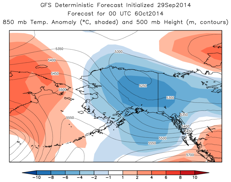
Forecast Showing Cold Spell

The medium-range forecast for interior Alaska has taken on a cold look in the past few days and is now showing a cold upper-level trough being carved out over the state by the weekend.  If this verifies, it would bring daytime high temperatures near or below freezing in Fairbanks and of course a good chance of accumulating valley-level snow.  According to the long-term average, the establishment of the permanent winter snowcover is still more than two weeks away, but it can happen in early October - for example, the 2000-2001 winter snowpack arrived on October 5.

The maps below show the ECMWF and GFS model forecasts of 850 mb temperature anomaly (shaded) for Friday afternoon, along with the 500 mb height (dashed lines); the models agree in showing temperatures more than 6 °C below normal over parts of the interior.  Of course, this is still 5 days out, so the details will undoubtedly change.


Friday, June 13, 2014

Bias-Corrected Sea Ice Forecast

This is a follow-up to Monday's post about the latest CFSv2 model forecast of much higher Arctic sea ice extent this summer and autumn.  In that discussion I showed that the model is predicting that the September mean ice extent will be the highest since 2001, but this does not consider the bias in the model forecasts.  Numerical weather prediction models always contain a certain amount of systematic error or bias, and therefore any careful analysis of the forecasts requires a bias correction to be performed by comparing the latest forecast to the forecasts that have been made in the past.  To allow users to do this, NOAA helpfully provides a complete history of "re-forecasts" (emulated forecasts) back to 1982 for the CFSv2 model; so I downloaded the history of sea ice forecasts made on June 10 and obtained a complete history of forecasts for September mean Arctic ice extent.

The chart below shows the history of June 10 forecasts, along with the observed September ice extent according to the National Snow and Ice Data Center.  Ice extent was defined as the area covered by at least 15% concentration of sea ice in the model, which matches the NSIDC definition.  Interestingly the model forecasts have a low bias over the entire history - see the bottom of this post for a discussion of this.  However, in recent years the forecasts have failed to capture the extent of the melt-out, i.e. the June forecasts have predicted much less change over time than has actually happened.

If we compare the forecast and observed ice extent to the 1982-2010 mean of each series, then we have a bias-corrected comparison, see below.  The model failure in recent years really stands out, but it is also clear that there is some skill in predicting the year-to-year variability.  This year's forecast is also really dramatic, because the model is predicting the highest extent since 1992 when compared to itself.  It seems highly unlikely that anything of this magnitude will actually happen, but it also seems likely that the model is capturing some kind of signal.  Based on my experience in seasonal forecasting, it is usually worth paying attention when the models show large anomalies, although usually the timing, magnitude, or location of the predicted anomaly is not quite right.


In regard to the low bias in the model forecasts, at first glance this appears to be the opposite of the bias claimed by the model developers in their published article (as helpfully pointed out by Brian): "For the sea ice prediction, sea ice appears too thick and certainly too extensive in the spring and summer... The model shows a consistent high bias in its forecasts of September ice extent."  The figure below is taken from the article and shows (in the lower left panel) that the June 15 forecasts produce ice concentration that is too high compared to the observations.  However, ice concentration is not the same as ice extent, and it seems possible that the model could be producing ice that is too densely concentrated but yet the 15%-area is too small.  I haven't yet obtained a history of observed sea ice concentration to be able to test this idea.


Monday, June 9, 2014

Increased Ice Extent This Autumn?

An intriguing long-range forecast has emerged recently from the NWS Climate Forecast System (CFSv2) model, which makes predictions of global climate conditions up to 9 months into the future.  The model is quite sophisticated and often does provide considerable insight into likely future climate anomalies; but recently the model has increasingly portrayed a scenario that seems implausible at first glance; the model is showing a notable uptick in Arctic sea ice extent (compared to recent years) during this year's melt season.  Given the remarkable and persistent warmth in the Arctic in recent years, and the strong trend for increasing autumn melt-out, it would be quite an interesting change if this year brought significantly higher ice extent - and it would be a considerable success for the CFSv2 model.

The chart below shows the most recent Arctic sea ice extent forecast from the model, showing a predicted mean extent of over 6.5 x10⁶ km2 in September.  The observed September extent since 1979 is shown in the second figure below; the big melt years were 2007 and 2012.  Last year saw a large rebound, but if the CFSv2 forecast is correct, the ice area this year will jump back up to a level not seen since 2001; this would certainly generate a great deal of discussion and interest in the climate community and beyond.


The maps below show the spatial distribution of the CFSv2 anomalies in the next three months.  Curiously, the model is showing anomalous ice cover persisting in the coastal margins of the Arctic Ocean from the Laptev Sea all the way around to the Beaufort Sea and the Canadian Arctic Archipelago; but the model shows a lack of sea ice farther north.  It is not clear if this is at all realistic; but I would note that last year the model performed rather well in predicting the September ice extent, and so I don't think the latest forecast can be dismissed out of hand.  The last chart below show the forecast from this time last year; the September 2013 ice extent verified at 5.4 x10⁶ km2, and so the forecast from June was just about spot on.

For those who may be interesting in following the CFSv2 forecasts, here is the website (scroll to the bottom for sea ice):

http://origin.cpc.ncep.noaa.gov/products/people/wwang/cfsv2fcst/


Tuesday, March 4, 2014

Higher Resolution Howard Pass Modeling

One of the highlights of last month's weather in Alaska was the reported extreme wind chill from the Howard Pass RAWS in the western Brooks Range; the event was discussed at some length on this blog.  I presented a cursory look at two relatively high-resolution model forecasts of the event, which showed very low wind chill but did not reflect wind speeds as high as reported from the RAWS anemometer (up to 91 mph sustained).  We speculated that if the extreme wind speeds really occurred, then higher resolution modeling might be required to capture the local flow processes.  Prompted by this notion, I recently ran the WRF model over a limited domain at higher resolution

To obtain a high resolution simulation without requiring prohibitive computing resources, I used a traditional nesting technique to embed progressively higher resolution domains within larger coarse-resolution domains.  The figure below shows the three smallest simulation domains at 9 km (white), 3 km (blue), and 1 km (red) grid spacing; an outer domain at 27 km grid spacing was also used, with initial and boundary conditions from the GFS model.  The location of Howard Pass is indicated with a white dot.  I performed the simulation on an Amazon cloud virtual machine, which is available at a relatively low hourly cost.


The model topography over the inner domain, with 1 km (horizontal) grid spacing, is shown below, along with the locations of 4 RAWS installations.  The model was initialized at 18 UTC (9am AKST) on February 14, and run for 30 hours.


The charts below show the hourly evolution of temperature and wind speed at the location of the Howard Pass RAWS, for the 1km simulation (red line) as well as the 5km WRF forecasts that were examined earlier.  The black lines indicate the reported conditions from the RAWS.  Clearly, the high resolution simulation showed wind speeds only slightly higher than the lower resolution runs in the latter stages, and still far below the RAWS reports.  The 1km WRF forecast temperatures were also considerably higher than the reported temperatures.


Looking at the other three RAWS sites within the inner domain, the 1km wind forecasts generally showed less discrepancy from the observations, although the forecast wind speeds were also much too low at the Noatak RAWS for most of the time.  It is interesting, however, to see that the 1km model produced a jump in wind speeds to observed levels for a few hours at the Noatak RAWS; the 5km WRF runs were unable to reproduce the higher wind speeds.


The modeled spatial distribution of wind speeds in the vicinity of Howard Pass is shown in the maps below at intervals of six hours; the RAWS location is indicated with a white dot.  Note that the wind vectors are not shown for all the grid points, as the grid is much finer than the spacing of the arrows suggests.  For scale, the plot area covers roughly 50x50 km.

It's immediately apparent that the model produced considerable variability in wind speeds within 10 or 20 km of Howard Pass, as we would expect in an environment of complex terrain.  According to these results, the highest wind speeds were located just downwind of the highest terrain but did not extend to the Howard Pass RAWS location; and the highest speeds were still well short of the RAWS observations.


For comparison, the wind speed in the lower resolution simulations at 30 hours is shown below for a region of approximately 200x200 km.  It seems that the area-average wind speed near Howard Pass was only slightly higher in the 1km simulation, but the higher resolution allowed more spatial variability to develop.


In view of these new results, is it less likely now that the reported extremes from Howard Pass represented reality?  Well, perhaps; but I would suggest that the 1km simulation may still be inadequate to capture what actually happened.  The major reason for this is that a 1km simulation is still too coarse to explicitly simulate the "boundary layer", which is the turbulent layer of air next to the ground (airflow higher aloft is usually laminar, not turbulent).  Numerical models like WRF use so-called parameterization schemes to calculate and represent the effects of sub-grid-scale transfers of heat and momentum in the boundary layer.  It probably goes without saying that the details of the boundary layer scheme will make an enormous difference for the model's predictions of wind speed near the ground - and I think it's possible that the WRF boundary layer schemes are ill-suited to capturing the kind of flow that was occurring near Howard Pass.  [Note that I re-ran the simulation through 12 hours with an alternative boundary layer scheme and obtained very similar results.]

To illustrate the flow environment over Howard Pass, the chart below shows the vertical profile of temperature and wind speed at 12 hours into the 1km simulation.  A strong inversion was present as very cold surface-level air flowed up and over the pass from the North Slope, and wind speeds were highest just above the surface.


Unfortunately a mistake in the model setup meant that I didn't obtain the fine-resolution vertical profile data for later times in the model run, but we know that the winds above the surface strengthened dramatically in the next 18 hours.  The map below shows the wind speed at 825 mb, which was about 750 m above the level of Howard Pass RAWS and near the level of maximum wind speed.  Note that the 825mb pressure surface intersects the ground in the lower right, hence the lack of data.  The predicted 825mb wind speed was 80-90 mph or higher over a wide area above and west of Howard Pass; this is supported by similar plots for 850mb from the 5km WRF runs (see maps below).


According to the model, then, very high wind speeds occurred not very far above the surface on the lee side of the high terrain, but the model does not show the high momentum reaching the surface.  Presumably this is because the strong low-level temperature inversion caused the boundary layer scheme to produce relatively little vertical mixing of momentum; but it's an open question as to whether this is realistic or not.

To summarize, 1 km modeling of the Howard Pass event fails to reproduce the extreme conditions reported by the RAWS.  However, the discrepancy between the model and the observations still doesn't necessarily invalidate the RAWS data; in the words of a famous British comedy film, "it's only a model".  The obvious way to test whether the boundary layer scheme is artificially damping the surface wind speeds would be to re-run the model with still higher resolution (close to 100m) so that the boundary layer scheme can be dispensed with; this type of simulation is called Large Eddy Simulation.  Unfortunately, however, this would probably require some dedicated research funding to obtain the necessary computing resources.