After a slow start to the warm season, much higher temperatures have reached the North Slope in the past couple of weeks. On Tuesday the airport at Deadhorse saw a high temperature of 80°F, making this the fourth consecutive summer that 80°F has been reached or exceeded there. Of course the all-time heat record of 85°F was set in 2016, as discussed here. But prior to 2015, the site went 13 years without getting out of the 70s.
It's also worth noting that the humidity has been very high, relative to normal, in recent days. According to the ASOS instrument at the Deadhorse airport, the dewpoint reached 61°F on Sunday evening, and the daily mean dewpoint was almost the highest on record - only a couple of days in 2004 were higher. The top-quality 5-minute data from the nearby CRN site tell the same story, with a peak dewpoint of 62°F on Sunday evening, and Sunday was the most humid (highest dewpoint) of any day in the short history of the CRN site at Deadhorse.
For context, the highest dewpoint so far in Fairbanks this summer is 58°F, and only two of Alaska's 21 CRN sites have seen a higher dewpoint than Deadhorse this summer (i.e. Nowitna NWR and Selawik Refuge).
Objective Comments and Analysis - All Science, No Politics
Primary Author Richard James
2010-2013 Author Rick Thoman
Thursday, July 26, 2018
Monday, July 23, 2018
Peak Summer Heat
The first and perhaps only sustained period of really hot weather this summer developed over the interior at the weekend. The National Weather Service noted several readings in excess of 90°F in the Fairbanks area on Sunday, but this did not include the airport climate site (88°F); it has been more than 5 years since 90°F was exceeded at the airport.
With mid-80s again today in Fairbanks, the last 7 days are already the warmest week of the summer despite the fact that it was distinctly chilly a week ago. This is a little later than normal to be observing the peak warmth of the season, although the absence of heat was itself a bit unusual until now.
The chart below shows a histogram of the dates of peak weekly mean temperatures in Fairbanks, based on daily highs (red), daily lows (blue), and daily mean temperatures (gray). Daily high temperatures tend to peak from late June through mid-July, but daily low temperatures often rise into mid-July as humidity and cloud cover increase. But by the latter third of July it's distinctly less common to see the summer's warmest weather.
Friday, July 20, 2018
Hourly Rainfall History
Recently I have spent a good bit of time digging into the history of hourly precipitation data from Fairbanks, with a focus on the warm season months of May through September. NOAA's hourly precipitation data set ostensibly covers 1949-2011, although there is inexplicably a long gap from 1952-1962 in Fairbanks; so I have filled this in by transcribing numbers from the historical LCD forms (a somewhat painstaking effort). I also brought the data up to the present using hourly ASOS observations.
For more analysis on heavy precipitation events in Fairbanks, but at a daily time scale, see this post from last October:
http://ak-wx.blogspot.com/2017/10/heavy-rain-frequency.html
Now that I'm in possession of a reasonably complete data set, there are a number of questions that can be answered. For instance, is there evidence that short-duration heavy rain events have become more common in Fairbanks? We might expect this in a warming climate with increasing moisture content. The chart below shows annual counts of days (May through September) with at least 0.5" of rain within a two-hour interval. I used a two-hour period so that the analysis captures events that crossed the top of the hour, and the chart starts in 1956 because we have essentially complete data since then. (But see a note at the bottom on the 1997 event.)
A striking result is the remarkable cluster of heavy rain events in 2005-2010: there were 8 separate events in 6 years, but the previous 50 years had seen only 10 such days in total. If we assume a Poisson distribution based on the first 50 years, it is extremely unlikely (p<0.0001) that 8 events would occur in 2005-2010 by random chance, so "something" in the climate was different (perhaps a remote climate influence). Interestingly, however, the last 7 years have seen only one of these heavy rain events.
The overall 62-year mean frequency of these events is 0.31/year, or a return period of 3.3 years, and this is nicely consistent with the NOAA precipitation atlas (https://hdsc.nws.noaa.gov/hdsc/pfds/):
For more analysis on heavy precipitation events in Fairbanks, but at a daily time scale, see this post from last October:
http://ak-wx.blogspot.com/2017/10/heavy-rain-frequency.html
And regarding the 1997 event that is included in the chart above: 0.75" of rain was reported for the daily total on June 8, 1997, but the hourly totals were not reported owing to a rain gauge malfunction. There's no way of knowing for sure, then, whether 0.5" fell in two hours at the airport, but it turns out this event was a well-documented severe storm and there's little doubt that it qualifies for the analysis here.
Here's a write-up on the storm by one of the NWS staff in Fairbanks:
http://worldagweather.com/richmond2007_fairbanks_storm_june_1997.pdf
Looking at the hourly METAR reports, a key observation was made at 8:58pm on the 8th, stating that hail and rain had begun at 8:13 along with a peak wind of 50 knots (perhaps the rain gauge was blown over!). Apparently hail fell for 18 minutes and rain for another 22 minutes. None of the other hourly observations from that day reported more than light rain, so it appears that most of the 0.75" fell in less than one hour.
It just so happens that the Pedro Dome radar was offline for most of the day, but a scan from 8:55pm showed a strong storm southwest of Fairbanks - see below (image courtesy of weather.us). As the storm was reported to be moving south in the METAR data, this is almost certainly the cell that brought chaos to the city.
Here's a write-up on the storm by one of the NWS staff in Fairbanks:
http://worldagweather.com/richmond2007_fairbanks_storm_june_1997.pdf
Looking at the hourly METAR reports, a key observation was made at 8:58pm on the 8th, stating that hail and rain had begun at 8:13 along with a peak wind of 50 knots (perhaps the rain gauge was blown over!). Apparently hail fell for 18 minutes and rain for another 22 minutes. None of the other hourly observations from that day reported more than light rain, so it appears that most of the 0.75" fell in less than one hour.
It just so happens that the Pedro Dome radar was offline for most of the day, but a scan from 8:55pm showed a strong storm southwest of Fairbanks - see below (image courtesy of weather.us). As the storm was reported to be moving south in the METAR data, this is almost certainly the cell that brought chaos to the city.
Wednesday, July 11, 2018
Still Frozen on the North Slope
It has been a relatively chilly summer so far in the northernmost parts of Alaska, with Utqiaġvik (Barrow) recording the coolest June since 1994; despite a high temperature of 57°F on the 25th, the monthly mean temperature was only 33.5°F. Only one June since 1980 has been cooler (1994); but prior to 1980 this was a typical mean temperature for June.
The cool conditions have been quite persistent for nearly two months now.
As a result of the chilly weather, some of the fresh water lakes on the North Slope are still frozen, as seen in the land-cover imagery from the Suomi polar orbiting satellite. The image below was taken at 4pm today; ice is indicated by light blue colors in the Arctic Ocean and the larger lakes of the North Slope.
Today's webcam images from the observatory at Teshekpuk Lake (the large lake in the image above) confirm the presence of ice cover:
The same images from yesterday showed more ice cover near the shore; meltout appears to be getting into full swing now. Compare the situation to what was observed on June 17 of last year: https://ak-wx.blogspot.com/2017/06/north-slope-thaw.html
The blame for the persistent chill lies with a trough that has transported Arctic air south into northern and interior Alaska; Fairbanks felt the effects of this about a month ago. Here's a map of the 500mb height anomaly for the month of June.
However, the 925mb temperature map for June puts Alaska's cool anomaly in perspective - see below. In contrast to the localized and rather mundane region of chill over northern Alaska, the central part of Arctic Siberia saw a very large and pronounced warm anomaly, and indeed the Siberian warmth was very extreme by historical standards. At the town of Saskylakh at 72°N (nearly the same as Utqiaġvik), the June mean temperature of 60.0°F was more than 5°F above any other June, with data back to 1936, and the month was a remarkable 17.5°F above the 1981-2010 normal.
The cool conditions have been quite persistent for nearly two months now.
As a result of the chilly weather, some of the fresh water lakes on the North Slope are still frozen, as seen in the land-cover imagery from the Suomi polar orbiting satellite. The image below was taken at 4pm today; ice is indicated by light blue colors in the Arctic Ocean and the larger lakes of the North Slope.
Today's webcam images from the observatory at Teshekpuk Lake (the large lake in the image above) confirm the presence of ice cover:
The same images from yesterday showed more ice cover near the shore; meltout appears to be getting into full swing now. Compare the situation to what was observed on June 17 of last year: https://ak-wx.blogspot.com/2017/06/north-slope-thaw.html
The blame for the persistent chill lies with a trough that has transported Arctic air south into northern and interior Alaska; Fairbanks felt the effects of this about a month ago. Here's a map of the 500mb height anomaly for the month of June.
However, the 925mb temperature map for June puts Alaska's cool anomaly in perspective - see below. In contrast to the localized and rather mundane region of chill over northern Alaska, the central part of Arctic Siberia saw a very large and pronounced warm anomaly, and indeed the Siberian warmth was very extreme by historical standards. At the town of Saskylakh at 72°N (nearly the same as Utqiaġvik), the June mean temperature of 60.0°F was more than 5°F above any other June, with data back to 1936, and the month was a remarkable 17.5°F above the 1981-2010 normal.
Wednesday, July 4, 2018
Possible El Niño Modoki
There has been a lot of talk in climate circles about the possibility of a new El Niño episode developing in the Pacific Ocean over the coming months, and this could become an influence on Alaska's weather patterns during the autumn and winter. Of course it was only two years ago that the very strong El Niño of 2015-2016 ended, so I think it would be surprising to see another major episode so soon; but there is a strong consensus among the seasonal forecast models that a significant El Niño is on the way. Here's the sea surface temperature (SST) forecast for early winter from the NMME models:
Enhanced southerly flow associated with the strong Aleutian trough tends to bring warmer than normal conditions to much of Alaska.
El Niño Modoki winters look very different; rather than showing a strong Aleutian Low, there's a notable tendency for high pressure from the Bering Sea to southern Alaska. It also tends to be warmer than normal over the Bering Sea and surrounding areas (see maps below). Note that these years are the top Modoki events that did not also have top-10 Niño3 (eastern equatorial Pacific) SST anomalies; so by definition they are also not strong El Niño episodes. We might think of them as weak-to-moderate warming episodes that were clearly focused on the central equatorial Pacific.
As we consider which "flavor" of El Niño might be more likely this year, we can ask how the current global SST pattern compares to the typical precursor patterns for the two varieties. First, the map below shows the SST pattern in June and July prior to east-Pacific El Niño's. The central and eastern tropical Pacific tend to be warmer than normal already by this time of year, and there's also a strong warm signal in the Indian Ocean.
The models expect the warmest SSTs, relative to normal, in the central equatorial Pacific, and this has also given rise to a bit of speculation that the coming El Niño (if it happens) may be more of a "Modoki" variety than a classic episode. El Niño Modoki is sometimes considered to be a distinct climate phenomenon in which warming occurs in the central portions of the equatorial Pacific, as opposed to the classic El Niño pattern that involves the most pronounced warming in the east. However, others emphasize that the Modoki versus classic distinction is really a continuum and is mostly related to the strength of the warming episode.
Regardless of the semantics, it's interesting to compare the winter climate patterns between central-Pacific and eastern-Pacific El Niño's. The Aleutian Low is usually stronger than normal during strong classic El Niño winters, and there is a pronounced low pressure anomaly centered to the south of the Alaska Peninsula, as shown in the map below. The years listed here were obtained by taking the top El Niño winters (based on the Multivariate ENSO Index) that were not also top-10 Modoki episodes (based on the El Niño Modoki Index).
Enhanced southerly flow associated with the strong Aleutian trough tends to bring warmer than normal conditions to much of Alaska.
El Niño Modoki winters look very different; rather than showing a strong Aleutian Low, there's a notable tendency for high pressure from the Bering Sea to southern Alaska. It also tends to be warmer than normal over the Bering Sea and surrounding areas (see maps below). Note that these years are the top Modoki events that did not also have top-10 Niño3 (eastern equatorial Pacific) SST anomalies; so by definition they are also not strong El Niño episodes. We might think of them as weak-to-moderate warming episodes that were clearly focused on the central equatorial Pacific.
As we consider which "flavor" of El Niño might be more likely this year, we can ask how the current global SST pattern compares to the typical precursor patterns for the two varieties. First, the map below shows the SST pattern in June and July prior to east-Pacific El Niño's. The central and eastern tropical Pacific tend to be warmer than normal already by this time of year, and there's also a strong warm signal in the Indian Ocean.
Does this resemble the current setup? Not at all; June SSTs were near-normal in the Indian Ocean and near or even slightly below normal in the eastern Pacific.
The map below shows the pattern for summers preceding Modoki episodes; there tends to be warmth in the central Pacific and also - interestingly - in the northern North Pacific, and especially the Gulf of Alaska. Overall this is a lot more consistent with the current pattern, and so this fits with the idea that El Niño, if it does emerge and persist into winter, is more likely to be a central-Pacific episode. It will be interesting to see how it plays out.
Friday, June 29, 2018
Warming By Season
A few weeks ago I alluded to the fact that the temperature increase of recent decades has been smaller in summer than at other times of year in northern Alaska; but when we consider that temperature variability is lowest during summer, the warming is still very significant at that season. It's worth illustrating this in a bit more detail.
First, the chart below shows the simple temperature difference between the 1971-2000 and 2001-2017 periods for 12 overlapping 3-month seasons throughout the year, for Utqiaġvik (Barrow) as well as Kotzebue, Nome, and Fairbanks. The temperature difference peaks in late autumn (October-December) for all 4 sites, and the amount of warming that has occurred in summer is ostensibly quite small in comparison.
However, when we normalize the temperature difference by the interannual standard deviation of the seasonal temperatures (during 1971-2000), the picture changes - see below. Autumn is still the time of peak warming, but the summer warming no longer appears insignificant. Interestingly, the summer temperature change at Kotzebue has been larger in standardized terms than the winter and spring warming; but at Utqiaġvik the summer trend remains less pronounced than at other times of year.
None of this is a big surprise, but I think it provides a bit of useful perspective on the significance of relatively "small" summer warming trends in the Arctic.
First, the chart below shows the simple temperature difference between the 1971-2000 and 2001-2017 periods for 12 overlapping 3-month seasons throughout the year, for Utqiaġvik (Barrow) as well as Kotzebue, Nome, and Fairbanks. The temperature difference peaks in late autumn (October-December) for all 4 sites, and the amount of warming that has occurred in summer is ostensibly quite small in comparison.
However, when we normalize the temperature difference by the interannual standard deviation of the seasonal temperatures (during 1971-2000), the picture changes - see below. Autumn is still the time of peak warming, but the summer warming no longer appears insignificant. Interestingly, the summer temperature change at Kotzebue has been larger in standardized terms than the winter and spring warming; but at Utqiaġvik the summer trend remains less pronounced than at other times of year.

None of this is a big surprise, but I think it provides a bit of useful perspective on the significance of relatively "small" summer warming trends in the Arctic.
Sunday, June 24, 2018
Are Fairbanks Summers Getting Wetter?
Hi, Rick T. here with a post about Fairbanks summer rainfall.
I was at a meeting a few weeks ago and one of the folks there, who works in community planning, was wondering if Fairbanks summers are becoming wetter. After all, the past five years (especially 2014 and 2016) have featured two of the wettest summers of record. If summers are getting wetter, that is something that planners need to take into account when considering things like downtown storm drainage capacity, rural road culvert sizing or generally higher river levels. Happily, here in Fairbanks we have enough historical data to take a stab at answering that question.
Since summer precipitation often comes in the form of showers and thunderstorms (especially the first half of summer) and these are much less frequent (climatologically speaking) over the flats as compared to areas closer to higher terrain, it's not a good idea to use the usual Fairbanks "threaded" climate record, since we know that the Fairbanks Airport, being out on the flats, receives significantly less rain than areas not far to the north and east. Luckily, we have precipitation observations taken in almost the exact same place, from the UAF Ag Farm, since July 1911. While there are some data quality problems with the Ag Farm observations over the decades, summer precipitation looks reasonable. Amazingly, there appears to be only one month that is actually missing, August 1969. For this one month I used the College Observatory data (taken on West Ridge near what is now called Jack Townshend Point, about 3/4 of a mile northeast of the Ag Farm). Here is scatter plot of the accumulated June through August precipitation at the Ag Farm for the past 106 years (1912 through 2017):
Just glancing at the graphic there is nothing obvious to my eye. The ten wettest and driest years are not all bunched-up on one or the other side of the plot. Naturally, there is some clustering: the 1920s saw a number of very dry summers and the 1940s several wet summers. Of course, we need not rely on our eyeballs; statistical analysis is our friend.
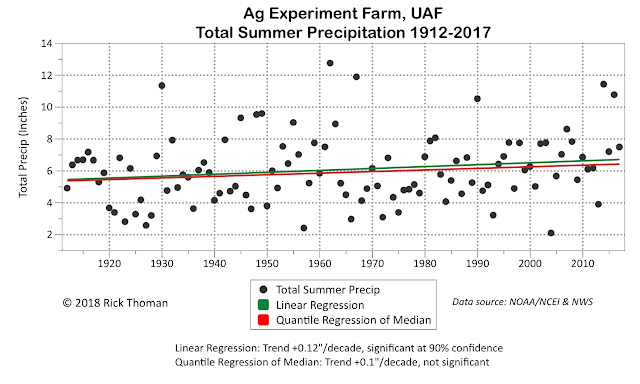
The simplest analysis is just linear regression. In the chart above I've plotted the observations along with ordinary linear regression (green line), which in effect is modeling the average (mean), and a technique called linear quantile regression, which here I use to model the median. A reason to check both is that ordinary linear regression is sensitive to individual values that are far from other values (i.e. "outliers"), while quantile regression of the median is not sensitive to extremes. In this case, we see that both flavors of linear regression show an increase of about an inch precipitation over the past century. For the ordinary linear regression this is significant at the 90% confidence level but not at the 95% level. The trend of the median summer precipitation is not significant at even the 90% level.
Of course, it's entirely possible (even likely) that changes in summer precipitation are not best described by a simple linear fit. Often in Alaska, a piecewise linear regression (i.e. "hockey stick") provides a better estimate of trend – but not in this case. There is no evidence of any significant changes in the linear trend.
Another change we can check for are any abrupt "step" increases. When we do this, the results are also mixed:
Here, the results are mostly dependent on the required length of any segment. Since we are looking a long term changes that might be important for community planning, I restricted the analysis to changes that persist at least couple of decades. Requiring a minimum length of 20 years shows one step increase, at 1998 (note: the analysis was not restricted to a single step change. With 106 years of data, as many as five step changes are possible). Interestingly, increasing the minimum length to 25 years results in no step changes of statistical significance.
The last analysis I'll look at here is a simple smoothing of the observed precipitation:
Here the brown line is a cubic spline fit to the data. Cubic splines are very commonly used to detect patterns (not just linear) in noisy data. In this case, looking only at the brown line, we see, much like the linear regression analysis, a general upward trend, especially since the 1990s, with a total increase of nearly two inches between 1912 and 2017. However, this is only part of the analysis. Since we don't know what the hypothetical "true" fit is, in this case primarily due to the spread in the summer to summer rainfall, we can construct confidence intervals that give us a better idea of where the actual (but unknown) fit lies. I've done that here, shown as the gray shading. Notice that the confidence interval at least partially overlaps itself for the full 106 years of records, e.g. look along the total precipitation 6" grid line. This suggests that we don't (quite) have high confidence that there really is a significant change in the spline fit.
So where does this leave us as to the original question? Are summers becoming wetter? It looks to me like the answer is an unequivocal "maybe".
On the yes side, the ordinary linear regression trend is significant at the 90% level, as is the 20-year minimum length step change.
On the no side, the trend of the median summer precipitation is not significant, and there is no significant step change when requiring a 25-year (or longer) length.
In the maybe camp, the cubic spline analysis is certainly suggestive of a significant change, just barely falling into the no trend camp (using a 95% confidence interval).
While this analysis is perhaps not satisfying from a community planning perspective, since "maybe" seems like it's not an "actionable" answer, from a climate perspective it is interesting that we are close to being able to detect an increase, which for precipitation in Alaska is not (yet) usually the case. However, increasing precipitation during the 21st century is exactly what the the climate model consensus have for nearly all of Alaska, and we may be starting to see that reflected in Fairbanks. The next several years will help to clarify the trend for the early 21st century.
I was at a meeting a few weeks ago and one of the folks there, who works in community planning, was wondering if Fairbanks summers are becoming wetter. After all, the past five years (especially 2014 and 2016) have featured two of the wettest summers of record. If summers are getting wetter, that is something that planners need to take into account when considering things like downtown storm drainage capacity, rural road culvert sizing or generally higher river levels. Happily, here in Fairbanks we have enough historical data to take a stab at answering that question.
Since summer precipitation often comes in the form of showers and thunderstorms (especially the first half of summer) and these are much less frequent (climatologically speaking) over the flats as compared to areas closer to higher terrain, it's not a good idea to use the usual Fairbanks "threaded" climate record, since we know that the Fairbanks Airport, being out on the flats, receives significantly less rain than areas not far to the north and east. Luckily, we have precipitation observations taken in almost the exact same place, from the UAF Ag Farm, since July 1911. While there are some data quality problems with the Ag Farm observations over the decades, summer precipitation looks reasonable. Amazingly, there appears to be only one month that is actually missing, August 1969. For this one month I used the College Observatory data (taken on West Ridge near what is now called Jack Townshend Point, about 3/4 of a mile northeast of the Ag Farm). Here is scatter plot of the accumulated June through August precipitation at the Ag Farm for the past 106 years (1912 through 2017):
The simplest analysis is just linear regression. In the chart above I've plotted the observations along with ordinary linear regression (green line), which in effect is modeling the average (mean), and a technique called linear quantile regression, which here I use to model the median. A reason to check both is that ordinary linear regression is sensitive to individual values that are far from other values (i.e. "outliers"), while quantile regression of the median is not sensitive to extremes. In this case, we see that both flavors of linear regression show an increase of about an inch precipitation over the past century. For the ordinary linear regression this is significant at the 90% confidence level but not at the 95% level. The trend of the median summer precipitation is not significant at even the 90% level.
Of course, it's entirely possible (even likely) that changes in summer precipitation are not best described by a simple linear fit. Often in Alaska, a piecewise linear regression (i.e. "hockey stick") provides a better estimate of trend – but not in this case. There is no evidence of any significant changes in the linear trend.
Another change we can check for are any abrupt "step" increases. When we do this, the results are also mixed:
Here, the results are mostly dependent on the required length of any segment. Since we are looking a long term changes that might be important for community planning, I restricted the analysis to changes that persist at least couple of decades. Requiring a minimum length of 20 years shows one step increase, at 1998 (note: the analysis was not restricted to a single step change. With 106 years of data, as many as five step changes are possible). Interestingly, increasing the minimum length to 25 years results in no step changes of statistical significance.
The last analysis I'll look at here is a simple smoothing of the observed precipitation:
Here the brown line is a cubic spline fit to the data. Cubic splines are very commonly used to detect patterns (not just linear) in noisy data. In this case, looking only at the brown line, we see, much like the linear regression analysis, a general upward trend, especially since the 1990s, with a total increase of nearly two inches between 1912 and 2017. However, this is only part of the analysis. Since we don't know what the hypothetical "true" fit is, in this case primarily due to the spread in the summer to summer rainfall, we can construct confidence intervals that give us a better idea of where the actual (but unknown) fit lies. I've done that here, shown as the gray shading. Notice that the confidence interval at least partially overlaps itself for the full 106 years of records, e.g. look along the total precipitation 6" grid line. This suggests that we don't (quite) have high confidence that there really is a significant change in the spline fit.
So where does this leave us as to the original question? Are summers becoming wetter? It looks to me like the answer is an unequivocal "maybe".
On the yes side, the ordinary linear regression trend is significant at the 90% level, as is the 20-year minimum length step change.
On the no side, the trend of the median summer precipitation is not significant, and there is no significant step change when requiring a 25-year (or longer) length.
In the maybe camp, the cubic spline analysis is certainly suggestive of a significant change, just barely falling into the no trend camp (using a 95% confidence interval).
While this analysis is perhaps not satisfying from a community planning perspective, since "maybe" seems like it's not an "actionable" answer, from a climate perspective it is interesting that we are close to being able to detect an increase, which for precipitation in Alaska is not (yet) usually the case. However, increasing precipitation during the 21st century is exactly what the the climate model consensus have for nearly all of Alaska, and we may be starting to see that reflected in Fairbanks. The next several years will help to clarify the trend for the early 21st century.
Thursday, June 21, 2018
Update on Lightning and Fire
Prompted by some comments on my post about Alaska fire acreage a couple of weeks ago, I acquired the most recent data from the Alaska Lightning Detection Network and pulled up a comparison to recent years - see below. Earlier this month the cumulative number of lightning strikes recorded by the network was the highest for the time of year in the modern data set, but ever since last week's cold blast there has been almost no activity (at least until today). (Note that the lightning sensors were changed in 2012, so it's not possible to do a direct comparison with earlier years.)
Fire acreage statewide currently stands at about 210,000 acres, which is also above most recent years, although 2013 and 2015 really took off in the latter part of June. Today's cumulative acreage is about 10 days ahead of the long-term median in terms of the rate of burning statewide.
The year-to-year variability in fire acreage is obviously much higher than that of lightning, as there are other critical factors that control fire growth. For example, both lightning and acreage were very high in 2015, but in 2013 acreage was high while lightning was relatively sparse; of course 2013 was very hot and dry, so fuel conditions were very conducive to the spread of fire.
Unsurprisingly, the ratio of acreage to lightning strikes is wildly variable - see below (calculated here whenever the cumulative number of strikes exceeds 1000). In 2015, over 30 acres burned for every lightning strike detected, on average. It would be interesting to compare this number to fire behavior in the lower 48.
While fiddling with the lightning data, I also determined the days on which the most lightning strikes were detected within 100 miles of a few different sites. This allows us to look at the typical weather patterns associated with particularly intense lightning activity in different parts of the state. For example, here's the average 500mb height pattern (the departure from normal) for strong lightning activity near Fairbanks: unusually high pressure aloft is centered to the northeast, and Fairbanks lies just to the south of the anomalous ridge axis.
When lightning activity is intense within 100 miles of McGrath, the ridge axis tends to be located much farther west, and a trough is evident over the Gulf of Alaska.
Below are the maps for strong lightning activity within 100 miles of Ambler and Eagle, respectively.
When lightning activity is intense within 100 miles of McGrath, the ridge axis tends to be located much farther west, and a trough is evident over the Gulf of Alaska.
Below are the maps for strong lightning activity within 100 miles of Ambler and Eagle, respectively.
Wednesday, June 13, 2018
Chilling in Summer
Northern and interior Alaska has seen some very chilly weather for the time of year in the past few days, as a strong upper-level trough and an unseasonably cold air mass plunged south out of the Arctic at the beginning of the week. Despite the fact that the summer solstice is now less than 10 days away, and daylight is continuous, sub-freezing temperatures have occurred in many of the usual cold spots in the interior.
In the Fairbanks area, three consecutive days have seen temperatures falling into the 30s, with upper 20s at the colder spots like North Pole and the Goldstream valley. The Smith Lake site on UAF's North Campus recorded 26°F yesterday morning; but the chart below (note the Celsius scale) shows that only a few days since late May have NOT dipped below freezing at this spot - even when daily high temperatures were well into the 70s.
The airport has seen 37°F, 36°F, and 37°F in the early mornings of the past three days, which is a remarkably cold series of daily minimum temperatures for this time of year. In fact, this is the closest to the solstice that Fairbanks has ever observed 3 straight days with low temperatures of 37°F or lower at the official climate site (1930-present).
It's also interesting to note that with a high temperature of only 53°F, Monday's daily mean temperature was a mere 45°F. It's been almost 70 years (1949) since Fairbanks saw such a chilly day this late in June (or in July).
The mid-level atmospheric pattern that created the midsummer chill is evident in the sequence of maps below. The charts show the 500mb analysis at 24-hour intervals from 4am on Saturday through 4am today, and for ease of reference the red dot shows Fairbanks' location. Notice the very tight pressure gradient and associated strong northerly flow that rushed down from the high Arctic into Alaska at the beginning of the week - this was a remarkable cold blast for the time of year.
Saturday:
Sunday:
Monday:
Tuesday:
Wednesday:
Finally, here's a nice view from Monday of the fresh snow that fell at Toolik Lake (2400' elevation) on the north side of the Brooks Range. The lake is still mostly frozen despite the fact that the air temperature reached 60°F earlier this month.
In the Fairbanks area, three consecutive days have seen temperatures falling into the 30s, with upper 20s at the colder spots like North Pole and the Goldstream valley. The Smith Lake site on UAF's North Campus recorded 26°F yesterday morning; but the chart below (note the Celsius scale) shows that only a few days since late May have NOT dipped below freezing at this spot - even when daily high temperatures were well into the 70s.
The airport has seen 37°F, 36°F, and 37°F in the early mornings of the past three days, which is a remarkably cold series of daily minimum temperatures for this time of year. In fact, this is the closest to the solstice that Fairbanks has ever observed 3 straight days with low temperatures of 37°F or lower at the official climate site (1930-present).
It's also interesting to note that with a high temperature of only 53°F, Monday's daily mean temperature was a mere 45°F. It's been almost 70 years (1949) since Fairbanks saw such a chilly day this late in June (or in July).
The mid-level atmospheric pattern that created the midsummer chill is evident in the sequence of maps below. The charts show the 500mb analysis at 24-hour intervals from 4am on Saturday through 4am today, and for ease of reference the red dot shows Fairbanks' location. Notice the very tight pressure gradient and associated strong northerly flow that rushed down from the high Arctic into Alaska at the beginning of the week - this was a remarkable cold blast for the time of year.
Saturday:
Sunday:
Monday:
Tuesday:
Wednesday:
Finally, here's a nice view from Monday of the fresh snow that fell at Toolik Lake (2400' elevation) on the north side of the Brooks Range. The lake is still mostly frozen despite the fact that the air temperature reached 60°F earlier this month.
Friday, June 8, 2018
Fire Season Begins
Lightning has been widespread over Alaska in the past several days, and wildfires have sprung up as an inevitable consequence. According to the latest information on akfireinfo.com, fires have burned about 25,000 acres statewide so far this season, which is about normal for the time of year. Fire activity typically ramps up quickly in June, with burn acreage often exceeding 200,000 acres by the end of the month.
Year-to-year variability of fire acreage in Alaska is a very interesting topic and a fascinating and challenging prediction problem. I'd like to do an in-depth study of it one day, but today I'll just make a couple of points. First, consider the map below, showing a 23-year correlation between sea surface temperatures in May and the subsequent fire acreage rank. I've used the rank of the fire acreage (with higher rank for higher acreage) rather than actual acreage numbers because the distribution is strongly non-Gaussian.
The color scheme on the map rather exaggerates the statistical significance of the correlations, as the highest values are only 0.4-0.5, but nevertheless it's interesting to see that fire activity is favored by warmer ocean conditions in both the northern North Pacific and the central tropical Pacific. The horseshoe-shaped pattern looks quite reminiscent of the PDO pattern, but actually it's a bit different; the typical PDO horseshoe hugs the coast of North America more closely and has a strong inverse correlation with SSTs extending east of Japan to south of Alaska. Alaska fire acreage is actually nearly uncorrelated with the PDO index in May.
There is a better correlation (+0.44) between Alaska fire acreage and the North Pacific Mode (NPM) index. The NPM pattern is focused between 40 and 50°N across the North Pacific, and according to the first map above, this is an area that shows some connection with Alaska fire activity.
So what do current conditions look like? The map below shows the May analysis; the NPM was slightly positive, as it has been for the last 4 months, but it's not a dramatic anomaly (excepting the Bering Sea warmth). This suggests that ocean temperature patterns are only slightly favorable for enhanced fire activity this year. As an aside, there seems to be no sign of the strongly positive NPM phase that the long-range models were predicting earlier in the year (and are still predicting).
We can also search for fire-acreage-related precursor patterns in the atmosphere. According to the map below, there is a statistically significant - but not highly robust - correlation between 500mb heights over Alaska in May and subsequent fire acreage. This makes sense; if the weather pattern sets up with a ridge over Alaska during May, then dry and sunny conditions will reduce fuel moisture, and the next month or two are also more likely than not to be warm and dry.
How about May 2018? Rather than having a ridge over the state, there was a trough over the southwest, and most of the interior was wetter than normal. So this points to reduced fire activity, albeit with low confidence.
And now perhaps the most interesting result that I've stumbled upon in this brief analysis. The map below shows the average SST anomaly in winters following the 6 most active fire seasons since 1995. Most readers will recognize the pattern immediately: the warm band along the equator in the central and eastern Pacific is a classic El Niño pattern. This suggests that very active fire seasons in Alaska have a strong tendency to be followed by significant El Niño episodes.
The chart below confirms the rather remarkable statistical connection; the 4 strongest El Niño's since 1995 were preceded by Alaska fire acreage in the top quartile (6 of 23) since 1995. Naively this suggests we can use Alaska fire acreage as a predictor for El Niño - but why would this be? My take is that the atmospheric and oceanic patterns that evolve into major El Niño events are already unfolding in the summer months prior to the classical winter peak of El Niño, and those patterns happen to be very favorable for Alaska wildfire.
The last point to make is that the latest data from the long-range computer models have recently shifted quite decisively in favor of El Niño for the coming winter (2018-19); so it will be most interesting indeed to see how the rest of the fire season evolves in Alaska.
Year-to-year variability of fire acreage in Alaska is a very interesting topic and a fascinating and challenging prediction problem. I'd like to do an in-depth study of it one day, but today I'll just make a couple of points. First, consider the map below, showing a 23-year correlation between sea surface temperatures in May and the subsequent fire acreage rank. I've used the rank of the fire acreage (with higher rank for higher acreage) rather than actual acreage numbers because the distribution is strongly non-Gaussian.
The color scheme on the map rather exaggerates the statistical significance of the correlations, as the highest values are only 0.4-0.5, but nevertheless it's interesting to see that fire activity is favored by warmer ocean conditions in both the northern North Pacific and the central tropical Pacific. The horseshoe-shaped pattern looks quite reminiscent of the PDO pattern, but actually it's a bit different; the typical PDO horseshoe hugs the coast of North America more closely and has a strong inverse correlation with SSTs extending east of Japan to south of Alaska. Alaska fire acreage is actually nearly uncorrelated with the PDO index in May.
There is a better correlation (+0.44) between Alaska fire acreage and the North Pacific Mode (NPM) index. The NPM pattern is focused between 40 and 50°N across the North Pacific, and according to the first map above, this is an area that shows some connection with Alaska fire activity.
So what do current conditions look like? The map below shows the May analysis; the NPM was slightly positive, as it has been for the last 4 months, but it's not a dramatic anomaly (excepting the Bering Sea warmth). This suggests that ocean temperature patterns are only slightly favorable for enhanced fire activity this year. As an aside, there seems to be no sign of the strongly positive NPM phase that the long-range models were predicting earlier in the year (and are still predicting).
We can also search for fire-acreage-related precursor patterns in the atmosphere. According to the map below, there is a statistically significant - but not highly robust - correlation between 500mb heights over Alaska in May and subsequent fire acreage. This makes sense; if the weather pattern sets up with a ridge over Alaska during May, then dry and sunny conditions will reduce fuel moisture, and the next month or two are also more likely than not to be warm and dry.
How about May 2018? Rather than having a ridge over the state, there was a trough over the southwest, and most of the interior was wetter than normal. So this points to reduced fire activity, albeit with low confidence.
And now perhaps the most interesting result that I've stumbled upon in this brief analysis. The map below shows the average SST anomaly in winters following the 6 most active fire seasons since 1995. Most readers will recognize the pattern immediately: the warm band along the equator in the central and eastern Pacific is a classic El Niño pattern. This suggests that very active fire seasons in Alaska have a strong tendency to be followed by significant El Niño episodes.
The chart below confirms the rather remarkable statistical connection; the 4 strongest El Niño's since 1995 were preceded by Alaska fire acreage in the top quartile (6 of 23) since 1995. Naively this suggests we can use Alaska fire acreage as a predictor for El Niño - but why would this be? My take is that the atmospheric and oceanic patterns that evolve into major El Niño events are already unfolding in the summer months prior to the classical winter peak of El Niño, and those patterns happen to be very favorable for Alaska wildfire.
The last point to make is that the latest data from the long-range computer models have recently shifted quite decisively in favor of El Niño for the coming winter (2018-19); so it will be most interesting indeed to see how the rest of the fire season evolves in Alaska.
Friday, June 1, 2018
North Slope Warmth Subsides
After a winter of record-breaking warmth in Alaska's northernmost city, temperatures have returned to near-normal levels recently, and even a bit below in the past week or so, as easterly flow has kept a chilly Arctic air mass in place.
The slight preference for cool conditions lately has prevented Utqiaġvik (Barrow) from seeing a sustained thaw so far this season; there has not yet been a day with mean temperature above freezing this year. It has been a few years since the first such day occurred as late as June, but we would have to go another 10 days or so for the absence of warmth to become really unusual. The chart below shows the long-term trend towards earlier first thaw day, and earlier first 50°F; both dates have advanced by more than a day per decade over the long-term history at Utqiaġvik.
The relative magnitude and persistence of the recent warming trend at different times of year is illustrated by the chart below. For each month in the past 15 years, I've plotted up the monthly mean temperature as a departure from the 1971-2000 normal, and the red markers highlight the anomalies since 2013. As we all know, warming has been most amplified in autumn as a direct result of sea ice loss. The absolute magnitude of change has been smaller in summer, as Arctic summer temperatures are rather strongly constrained by the presence of at least some sea ice; but the summer warming is nevertheless very significant as the variance is much smaller in the warm season.
The year labels at the top of the columns indicate months in which the monthly-mean temperature records were broken in the past winter. Remarkably, from November-March, 4 of 5 months saw monthly mean temperatures higher than any observed before.
Just to drive home the magnitude of what happened in the winter that recently ended, the chart below shows the November-March mean temperature for each winter since 1930-31; and the high-quality CRN data are fully consistent with the airport temperatures over the past 16 years. A linear trend obviously doesn't capture what is happening here.
Subscribe to:
Posts (Atom)


