
Figure 1. State Forecast product issued by the Anchorage NWS Office on October 22, 2010.
In Figure 1, you will notice a series of minimum, maximum, and precipitation probability forecasts. Unfortunately, only the Anchorage and Juneau offices issue State Forecasts; hence, our analysis will focus on Anchorage (I know, not very Deep Cold). A choice must be made as to whether to use the morning or afternoon issuance. In this case, we used the afternoon forecast product, which effectively gives us a 6 day forecast. This option provides the shortest time window for assessing the Day 1 forecast (best case scenario) and makes the day-to-day comparison more meaningful. It also allows for a baseline to conduct a persistence forecast comparison. On the negative side, it eliminates Day 7 as a forecast period.
Forecast temperatures vs. Actual Temperatures
When looking at days 1 through 6, we see decreasing skill in the temperature forecast. This is not surprising, as we would expect this result for every forecast issued anywhere in the world. The question is how much value do we get from the forecast compared to another method. In Figures 2 and 3, we see the 2009-2013 difference between the forecasted temperature and the actual temperature for Day 1 through Day 6. Figure 2 is a summary by year and Figure 3 is a summary by month.
On both charts, we see decreasing skill the farther out in time we get; however, the actual forecast always exceeds the no skill forecast (climatology). The most dramatic forecast skills are in the winter months when the skill for Day 1 through Day 3 is especially high. A noticeable drop off is observed by Day 4. We see in Figure 2 that on average, the Day 1 forecast provides 3°F of improvement versus climatology and the Day 6 forecast provides 1.3°F of improvement.
A caveat regarding 2009 and 2013 in Figure 2. Those years had very large temperature anomalies and so the forecast skill for those years suffered accordingly.
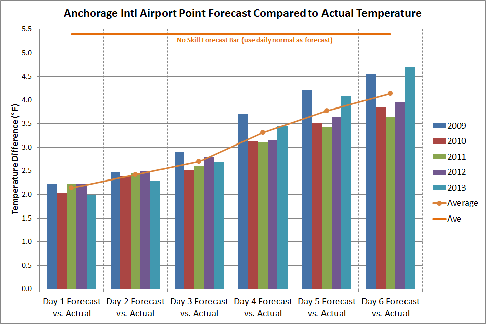
Figure 2. Difference (absolute value) between forecasted temperature and measured temperature for Day 1 through Day 6 in Anchorage, Alaska, between 2009 and 2013. All months are aggregated for each year.

Figure 3. Difference (absolute value) between forecasted temperature and measured temperature for Day 1 through Day 6 in Anchorage, Alaska, between 2009 and 2013. All years are aggregated for each month.
Forecast temperatures vs. Climatology
If you had no access to television, radio, or the Internet, one option for generating a 6-day forecast is to predict that each day will be exactly normal; i.e., just use the numbers from the NCDC normals table. As it turns out, climatology appears to be a factor in the NWS forecast. As a forecaster, you would feel comfortable predicting that Day 1 is 20°F above or below normal based on the numerical models is the situation was warranted; however, the comfort level with a forecast of 20°F above or below normal for Day 6 is much reduced. Therefore, the forecast is tempered somewhat by trending it toward climatology. Figures 5 and 6 show the difference between the forecasted daily temperatures and the NCDC published temperature.
Looking at Figure 4, the Day 1 forecast is slightly more than 5°F different than the published normal temperature. However, by Day 6, the forecasted temperature is 3.7°F difference than the published normal temperature. In Figure 5, we see the breakdown by month. In every month and in each year, the forecast trends toward the climatological daily normal.

Figure 4. Difference (absolute value) between forecasted temperature and the NCDC published normal temperature for Day 1 through Day 6 in Anchorage, Alaska, between 2009 and 2013. All months are aggregated for each year.

Figure 5. Difference (absolute value) between forecasted temperature and the NCDC published normal temperature for Day 1 through Day 6 in Anchorage, Alaska, between 2009 and 2013. All years are aggregated for each month
Which Forecast is the Best?
So how do the point forecasts for Days 1 through 6 compare to a no skill forecast? For this analysis, we add a second type of no skill forecast called persistence. This is where you forecast that the temperature tomorrow will be the same as the temperature today. This can be extended all the way out through Day 6. When we do this, the results are shown in Figure 6.
We see that over the course of out 5-year period, the NWS forecast for the Anchorage International Airport is off by slightly more that 2°F (see Figure 3 for an NWS forecast breakdown by month). This is 1.1°F less (better) than a strict persistence forecast and 3.3°F less (better) than a climatology forecast (see orange line in Figure 3 for a climatology breakdown by month).
By Day 3, the climatology forecast catches up with the persistence forecast. Looking out to Day 6, the NWS forecast sill exceeds climatology by 1.3°F. The maximum differential between the NWS forecast and the no skill forecast is at Day 3.
Due to high variability of temperatures from year-to-year, it is impossible to assess the relative forecast improvement over this short time period. However, there is a large skill improvement when using the NWS forecasts for temperatures as compared to the alternatives.

Figure 6. Difference (absolute value) between actual temperature and three forecast methods for Day 1 through Day 6 in Anchorage, Alaska, between 2009 and 2013.
Very nice, Brian. I especially like Figure 3; it shows the high value of the forecasts in winter, even at Day 6, and the rather low value in summer, even at Day 1.
ReplyDeleteAnother baseline metric that people sometimes use is "persistence climatology", which is the subset of climatology conditioned on the current anomaly. For example, if it's 10F below normal today, the history shows it is most likely to be 7F below normal tomorrow - so that would be our persistence climatology forecast. This is better than either persistence or climatology alone, and can be tough to beat.